Connect the dots

In my continuing journey to define my unique selling proposition, here is another personal infographic. This one describes the kind of thinking that makes me happiest: The challenge of taking a disconnected or even seemingly impossible set of conditions and making sense of it.

It starts with making sure all the known points are on the map. Then, explode the system out into a Rube Goldberg contraption of craziness — discover the unknown points, explore the context, and swim in the data until patterns emerge. Once the systems and opportunities are revealed the really hard part begins, isolating the key points and wrangling them into a deceptively simple system. That last part usually takes a few iterations.

This is a typical design thinking approach, certainly not unique to me, and it was fun to go through the process to make the graphic about the process. I’m hoping all this will lead me to more clearly articulating my own key points and system.

Five-finger discount

Cognac is crazy popular in my neighborhood judging by how quickly the shelves are cleared out during a sale. And to keep those shelves from emptying themselves, cognac is always locked up.

What’s a brand to do when it becomes known for being shoplifted? If you’re Hennessey, you create a branded, locked case.

It can be presented as a theft-protection freebie for small stores, but the resulting in-store brand advertising is the gift that keeps on giving. There’s also a subtle message about the product being so coveted and valuable, it has to be locked up. Well played.

The opposite of inspiration

A client’s main office has a thoroughly depressing interior despite the building’s landmark architecture. The drabness is made all the more noticeable in contrast to their recent brand refresh, which uses great colors and smart messaging.

Every time I visit I think about what a disconnect this is — the employee experience doesn’t match the bright, friendly customer experience they are trying so hard to create. They’ve overlooked the physical environment and employee experience as part of brand alignment, a common mistake.

I thought the endless clusters of beige cubes were the worst of it until I had a meeting in this conference room, which is apparently where teal chairs from the 80s go to die.

Subversive landscapes

In the Hung Liu retrospective Summoning Ghosts at OMCA, her emotional, insightful paintings hold unmistakable power. But it was a room of tiny, impressionistic landscapes that riveted me. The room info reads:

“In Maoist China, art was required to support revolutionary ideology and ‘serve the people, heart and soul.’ When Liu began studies in Beijing in the early 1970s, she would often go out alone to the countryside to paint for pleasure. She used small canvases that could fit inside her painting box that she carried in a bag. These bucolic paintings of landscapes, railroad bridges, old factories, and even trash cans and public toilets were kept hidden during the Cultural Revolution for fear their lack of political content could be used against her.”

I love experiences that take what you know and turn it inside out. Historically, nature was a safe subject for artists, containing little social or political commentary that might upset a patron. Artistic style itself has been known to cause a ruckus – just ask the Impressionists that these landscapes coincidentally channel – but, in message, the most a simple landscape might hope to convey is glorifying nature or the pastoral life. Hardly a major offense.

But under a regime that banned intellectual pursuits, art’s only allowed purpose was as propaganda. Not carrying commentary was exactly the problem. Amazing.

A sign-off screen that brings customers back

turbotax_messageIt’s supremely frustrating to see customers walk away without knowing why. Because if you don’t know why, you can’t fix it.

After signing out of TurboTax last night, I received the message shown. It’s friendly and smartly user-centric, no doubt the result of research into why people abandon the software. They want to make sure I return, because they don’t get paid until I finish and submit my tax forms through their service.

Displaying empathy and helpfulness, the sign-off screen prompts me to set a reminder to return so I don’t procrastinate too long or find help if I’m quitting out of frustration. Above all, it turns my walking away into an opportunity to improve the customer journey and close the sales loop. It’s a nice example of insights, UX, and messaging coming together simply and effectively. Nice job, Intuit!


Small Giants

smallgiants
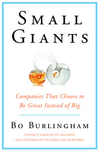
The book Small Giants resonated with me in a way few business books ever have. Author Bo Burlingham defines small giants as “companies that choose to be great instead of big”, an idea near and dear to my heart.

As a young designer in Chicago, my employers and clients were small companies. At the time I wasn’t aware how special those early experiences and relationships were. The work seemed, frankly, boring and limiting. I was antsy to move on to bigger agencies and brands.

After relocating and landing in a Silicon Valley agency, I found myself deeply conflicted. My heart wasn’t in working for mainstream, consumer brands. I missed the thoughtfulness and intimacy of the work I had done before. I missed the sense of purpose gained from helping good people realize their dream of owning a thriving business. Words of wisdom from a long-forgotten designer echoed in my head:  “There are no good projects, only good clients.”

After the agency collapsed, I struck out on my own. Eager to get back to “good clients”, I thought about what my favorites had in common. Here’s what I knew: They sold something of tangible value, and they did it honestly. They were fair to suppliers and partners. They were small and closely held, often family-owned. They treated employees with respect and generosity. They were local businesses — what defined that wasn’t clear, but I knew it when I saw it — and they supported community service and philanthropy. In short, the world was better with than without them.

This led me to a loose concept of social responsibility: doing business with integrity, giving back to the community, and treating people well. It also seemed being privately held was the key to being able to control everything else. Those became my four criteria for choosing clients ten years ago.

Finding Small Giants was inspiring and validating. Finally, a cogent description of what I’d intuitively understood but been unable to define! An entire book about the business unicorns I love! I now have a clearer sense of who the right clients for me are, and new insights into what to look for.

One idea that hadn’t previously gelled as part of my definition was limited growth — choosing to grow only when it serves strategic goals and doesn’t sacrifice culture or ideals. Growth has become such an unquestioned requirement of business that not growing is surprisingly radical.

Another insight was that “small” isn’t necessarily what makes my clients a good fit for me. It’s having a family culture, engaged leadership, and sense of purpose where I thrive. While it’s certainly easier to maintain those in a small company, there may be mid-sized companies that also fit this bill.

I also love the inclusion of soul, or mojo, that Burlingham cites as a secret ingredient. Running counter to management playbooks and belief in predictive data, it acknowledges there is a special magic that allows a company to be intimately, deeply great. That I couldn’t concretely define what I loved about my clients makes sense — there is simply a quality. They either have it or they don’t, and no logic model can predict it.

Finding small giants is no easy feat. But with renewed inspiration and clarity, I look forward to seeking more of them as clients and also to doing my part to help aspiring small giants find their mojo.
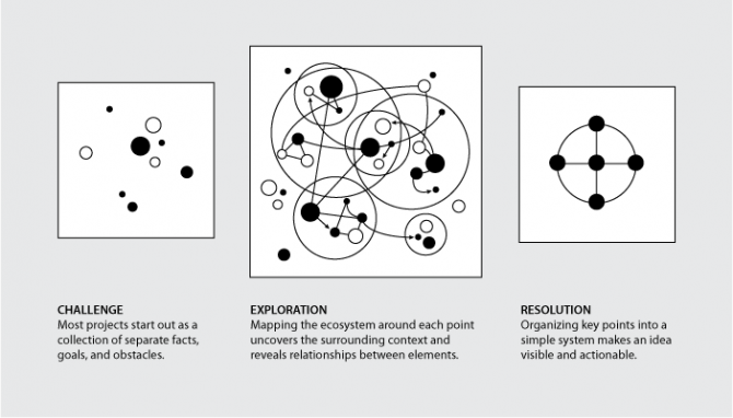
Packaging for Dummies

I laughed when I saw this. Part of me wants to be offended by packaging that assumes our incompetence, but considering how many times I’ve overlooked or mangled a resealable strip I have to admit it’s spot-on.

open_here

Mine

I love this feature in my newest Boden catalog – sticky tabs to flag items you like instead of having to turn down page corners. Arriving days before Valentine’s Day, its messages of “Mine” and “Love” also subtly (cleverly?) call to mind candy conversation hearts.

Putting on my marketer hat, I’d add a tab labeled Gift. Even if the shopper doesn’t end up purchasing any gifts, the prompt nudges them to think about friends while browsing and share Boden items they might like. And, on a personal note, I’d feel less frivolous about shopping if I could convince myself I was also shopping for my friends!

ef_blog_boden

The perfect sentence

Yesterday I experienced one of those rare moments when everything clicks into place and you realize you’ve created something perfect. One simple sentence capturing the essence of brand vision — it has personality and heart without being cutesy, and clarity without being tactical. It is, dare I say it, pithy!

We’ve been exploring brand strategy and key messaging for months, but until now we didn’t have the expression quite right. Considering I’m wrapping up the project this week, my perfect sentence is a timely capstone on a wonderful project!

Back to 1968

The 1968 exhibit at OMCA is so packed with facts and experiences I needed a second visit to take it in. As years go, it’s hard to imagine many more momentous in modern U.S. politics and culture than 1968, considering the assassinations of King and Kennedy, a pivotal election, the Vietnam War, and countless civil rights clashes.

Balancing the social upheaval were charming artifacts of my childhood. The living rooms were comfortingly familiar, complete with glass grapes on the cabinet TV, mid-century furniture, and World Book encyclopedias. Between the homes of my family and neighbors, every single item was familiar. There were also fun collections of advertising and, naturally, plastic.

For me the biggest highlight was the TV nook, a nice mood lifter following the Vietnam War exhibit. It doesn’t sound like much on paper — cartoon-like MDF television frames housing clips of movies and shows  — but in execution it was a fantastically engaging, seamless symphony of audio and video. There’s a particularly nice moment in the beginning of the loop where Planet of the Apes melds into the Star Trek voiceover, drama contrasted by the gentle ending of Mister Rogers promising us a smile and a hello tomorrow.

OMCA creates relevant, contemporary exhibits that inspire me. I’m so privileged this is my local museum!

OMCA 1968 RFK