
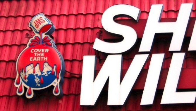
 Recently I was astonished to see this Sherwin Williams logo, which I assumed old signage. Seriously, who in the world would think this logo is a good idea? I was wrong. This very old mark — which, to its credit, looks decades newer than its pre-1900 origins — is in fact still the approved Sherwin Williams logo. How have I never noticed this before?
It’s easy to imagine an ambitious young paint company loving the original idea: “Wouldn’t it be great if we could paint every building in the world with our revolutionary standardized paints?” But in the current context of environmental awareness, the intent is overshadowed. Even if you overlook the bloodiness of the paint they are still, quite literally, pouring toxic paint over the earth.
Paint that ends up down drains and in landfills is a hazard to environmental health and water supplies, and this image gives the worst possible impression of their attitudes towards corporate responsibility. I can hardly grasp what must be flat-out stubbornness behind the decision to stand by this logo. More companies should honor their brand history, but this is simply an absence of good sense.
In branding, your intentions don’t matter; what matters is what people perceive. Sherwin-Williams has a statement defending the mark and their sustainability initiatives, but refusing to acknowledge public perception is a colossal branding misstep.