I laughed when I saw this. Part of me wants to be offended by packaging that assumes our incompetence, but considering how many times I’ve overlooked or mangled a resealable strip I have to admit it’s spot-on.

I laughed when I saw this. Part of me wants to be offended by packaging that assumes our incompetence, but considering how many times I’ve overlooked or mangled a resealable strip I have to admit it’s spot-on.
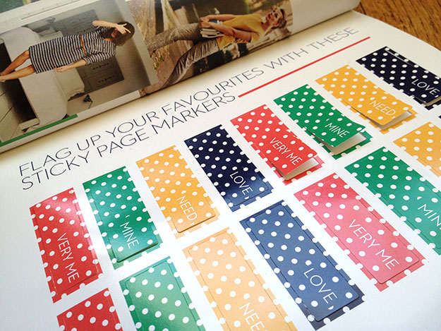
I love this feature in my newest Boden catalog – sticky tabs to flag items you like instead of having to turn down page corners. Arriving days before Valentine’s Day, its messages of “Mine” and “Love” also subtly (cleverly?) call to mind candy conversation hearts.
Putting on my marketer hat, I’d add a tab labeled Gift. Even if the shopper doesn’t end up purchasing any gifts, the prompt nudges them to think about friends while browsing and share Boden items they might like. And, on a personal note, I’d feel less frivolous about shopping if I could convince myself I was also shopping for my friends!

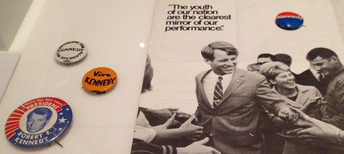
The 1968 exhibit at OMCA is so packed with facts and experiences I needed a second visit to take it in. As years go, it’s hard to imagine many more momentous in modern U.S. politics and culture than 1968, considering the assassinations of King and Kennedy, a pivotal election, the Vietnam War, and countless civil rights clashes.
Balancing the social upheaval were charming artifacts of my childhood. The living rooms were comfortingly familiar, complete with glass grapes on the cabinet TV, mid-century furniture, and World Book encyclopedias. Between the homes of my family and neighbors, every single item was familiar. There were also fun collections of advertising and, naturally, plastic.
For me the biggest highlight was the TV nook, a nice mood lifter following the Vietnam War exhibit. It doesn’t sound like much on paper — cartoon-like MDF television frames housing clips of movies and shows — but in execution it was a fantastically engaging, seamless symphony of audio and video. There’s a particularly nice moment in the beginning of the loop where Planet of the Apes melds into the Star Trek voiceover, drama contrasted by the gentle ending of Mister Rogers promising us a smile and a hello tomorrow.
OMCA creates relevant, contemporary exhibits that inspire me. I’m so privileged this is my local museum!

This photo mashup series by Shawn Clover that merges images from the 1906 earthquake and San Francisco today is a fantastic concept, with stunning execution.
From the artist:
To put these photos together, I first create a catalog of historical photos that look like they have potential to be blended. Unfortunately most of these photos end up on the digital cutting room floor because there’s simply no way to get the same photo today because either a building or a tree is in the way. Once I get a good location, I get everything lined up just right. My goal is to stand in the exact spot where the original photographer stood. Doing this needs to take into account equivalent focal length, how the lens was shifted, light conditions, etc. I take plenty of shots, each nudged around a bit at each location. Just moving one foot to the left changes everything.
I am in awe.
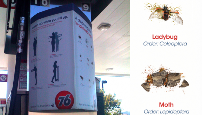 Recently I had the pleasure of keeping my brother company as he drove a U-Haul across half of Arizona and California. After the endless desert dotted with horribly designed billboards along I-10 and the vast nothingness along I-5, our very boring trip was brightened by cute ads at a 76 station.
First I noticed the Children’s Guide to Splattered Bugs at the pump. It was so unexpected that it took a minute for me to realize the flip side wasn’t the same, but another fun sign, Loosen up While you Fill Up, offering much-needed stretching tips. The campaign tagline, We’re On the Driver’s Side, is a clever play on the gas tank arrow. (One could debate this on more political level, but superficially it’s great.)
I did some digging, and it appears this campaign is credited to Venables Bell, and they get props for creating something with just the right amount of levity to catch attention without being over the top. It’s cute, clever, and got me to pull out my iPhone and snap photos. Job well done!
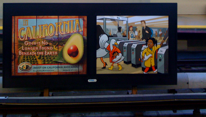 I love public art, and this new series of surreal scenes on (and about) BART is charming.
A few weeks ago I snapped this poster of the little girl and the duck at my local BART station, wondering what it was. Other than the station scene, the poster offered no clues to the purpose or message.
Fortuitously, a Facebook friend posted a link to this article about the posters, which are whimsical stories created by Josh Ellingson. In each scene a child’s fantasy crosses over into reality — a boy with the undersea-themed backpack spots a deep sea diver with a squid, a boy with a toy rocket sees rockets zooming past through the window, and a girl with a toy duck passes a duck with a toy girl. While they celebrate the adventure of travel, in keeping with transit poster tradition, they are mostly just plain fun and avoid seeming like ads.
Transit art is my favorite type of public art because it adds much-needed lightness and beauty to what is so often drudgery. Years ago while commuting on a bus in Chicago, I saw an excerpt of a Mark Strand poem about a snowflake that affected me so much I was inspired to jot down the name and buy the book. (And I’m not even a poetry fan!) Recently on the Metro light rail in Phoenix I also spotted mosaic sculptures built into platform shelters.
There is currently a MOMA exhibit of London Underground posters from the 1920s-40s, including pieces by E. McKnight Kauffer (one of my favorites of the era) and László Maholy-Nagy. Unfortunately this kind of poster has largely disappeared, replaced by commercial ads, but sometimes we get lucky and find ones like the new BART series or the iconic national parks posters by the amazing Michael Schwab.
I hope to see more art like this popping up. The Bay Area has a tremendous wealth of artists and stories to tap into, and in these tough times we could all use more beauty and levity around us.
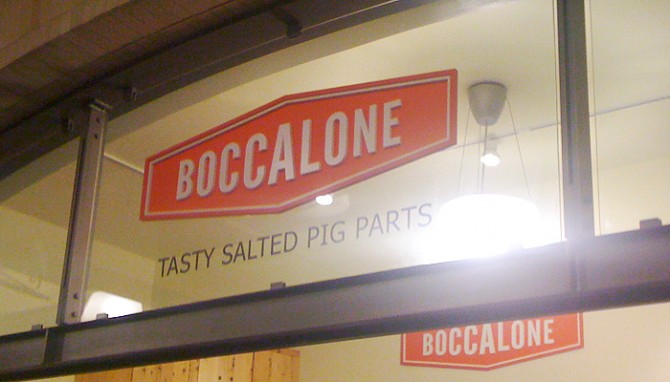 I saw this sign at the Ferry Plaza, and burst out laughing. Tasty Salted Pig Parts?!
People think of SF as a vegetarian heaven…and it is. It’s also a city that worships local, artisanal meats, especially pork. In line with the recent restaurant trend of house-made salumi, Boccalone sell cones of salumi to Ferry Plaza passers-by, and there was certainly no shortage of customers. Even better, the folks from Prather Ranch were selling t-shirts that said “Praise the Lard.” I love this town and all its delicious food affectations.
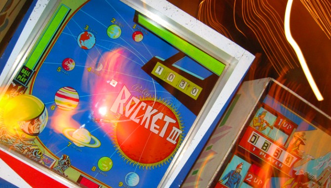
 The image above is a detail from a poster I have been working on for my Mythology pinball project. I was having such a good time learning about the visual language of pinball that I got a little carried away on this poster — this is the kind all-consuming project that makes it hard to get any other work done!
Something I’ve discovered in the MBA program is how much I love creating process diagrams and visualizations. I spent many years as visual designer, but my experience was largely designing identities and content rather than ideas and processes. Getting more experience with this kind of visual documentation has given me a larger set of tools for sorting information and finding relationships between ideas. Plus, it’s fun!
 For my elective class this semester I chose Mythology, Meaning, and Design, an exploration of myths, archetypes, and symbols and how they continue to play out today in modern storytelling such as media and branding. So far it’s a very demanding class — more than an elective is worth, probably — but I’m having fun with it.
For our second module I’m investigating of the experience of pinball: why people love the game and why there has been a small recent revival. Conveniently, the Pacific Pinball Expo just took place, and in Alameda there is a local pinball palace/museum, Lucky JuJu, so I have been able to observe players in their natural habitat.
The most surprising discovery has been the charming art of pinball. Before licensed themes became dominant (the era I played in as a child) there were decades of beautiful graphic art exploring every pop culture theme from science fiction to sports to the Old West. (Hmm, see any myths there?) Rows of seemingly endless machines displayed an incredible collection of this unique but endangered American art form
So far in this project I’ve created an epic pinball infographic that think may be portfolio material. Next, for the branding portion of the project I’m considering designing a beer company with the pinball art as a centerpiece. Can’t wait!
I live in downtown San Leandro, California, a city east of San Francisco that is more like a small town than a suburb. It’s one of the most walkable areas I’ve ever lived — better than my neighborhoods in SF and Chicago, even — and the city is working hard to develop the downtown core as a transit village.
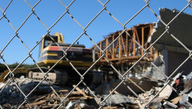
The newest target of redevelopment is former Albertson’s grocery store, Lucky before that, which sat empty for years after more than 55 years in operation. After Albertson’s pulled out, the city failed to lure a Trader Joe’s and then the neighborhood blocked two discount chains who wanted the space. The fight between those who want to gentrify downtown and those who want to bring in retailers that would serve the working-class locals is a familiar tug of war.
Fenced off and neglected, the abandoned store has long been an eyesore, a constant reminder of a struggling city in a tough economy. As I learned when researching a food project, empty grocery stores are a particular challenge to re-let — they have an architecture and square footage that is unique to grocery stores, yet other grocers are wary of taking on a failed space. After many tanked plans and heated discussions, the city has purchased it to use as a temporary parking lot while they rebuild a downtown garage. After that, they will attempt to find retailers to anchor a mixed-use space. I can only hope by then the economy will have strengthened and other city development plans will have taken strong enough root to support it.
The company in charge of the demolition claims to be “environmentally conscious”, recycling 75% of materials generated and properly handling toxins. It’s such a specific claim it makes me wonder if this is unusual, or if most firms do it but don’t talk about it. After all, they are paid for scrap and charged for landfill runs so it would be logical for most demolition companies to encourage recycling at a minimum. On the other hand, I have watched firsthand as a construction crew junked leftover, whole pieces of expensive material. Even if the owners and contractors don’t support waste, this ethic may not trickle down the the workers who simply want to get the site cleared as fast as possible.