Hello Kitty, hello cuteness

hellokittybillboardOn my recent trip to Taiwan and Tokyo, the cute factor was inescapable. Buildings, restaurants, museums, you name it. Everything has a mascot. Everything has an animated character. And the queen herself, Hello Kitty, continues to reign supreme.

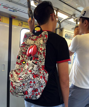
But of course Hello Kitty is more than a mere character. She’s a phenomenon and even a way of life, and has been for 40 years. Even guys can be spotted with HK gear. (Full disclosure: I still have the plush Hello Kitty I got in the 4th grade.)

hellokittybackpack
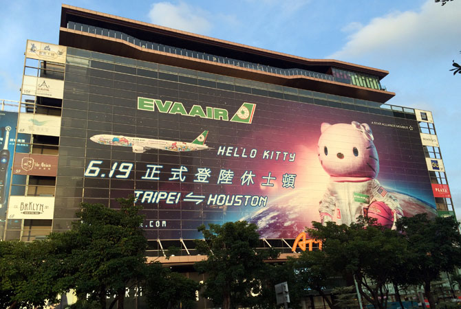
Our trip coincided with the debut of the new EVA Air Hello Kitty route to Houston. The subway and street ads feature Kitty as an astronaut, which makes sense. Why she carries a basketball, I couldn’t say. Maybe the Taiwanese are crazy about the Houston Rockets?

These themed routes have special planes decked out in Hello Kitty from tip to tail. It has to be seen to be believed. The depth and detail is truly astonishing — in addition to the plane wraps, there are more than 100 Hello Kitty branded items inside the plane, from the lavatory soap to the food to the toilet paper. EVA Air has even redesigned its airport counters and kiosks to promote the collaboration. It’s like a a giant Sanrio store.

I can’t even wrap my head around the amount of work and money this must have taken to build out. The licensing and contracts alone, much less the design, printing, and manufacturing costs to duplicate everything on a plane… amazing. They report it’s expensive, but profitable.

That is what you call brand equity.

Mine

I love this feature in my newest Boden catalog – sticky tabs to flag items you like instead of having to turn down page corners. Arriving days before Valentine’s Day, its messages of “Mine” and “Love” also subtly (cleverly?) call to mind candy conversation hearts.

Putting on my marketer hat, I’d add a tab labeled Gift. Even if the shopper doesn’t end up purchasing any gifts, the prompt nudges them to think about friends while browsing and share Boden items they might like. And, on a personal note, I’d feel less frivolous about shopping if I could convince myself I was also shopping for my friends!

ef_blog_boden

On the Driver’s Side

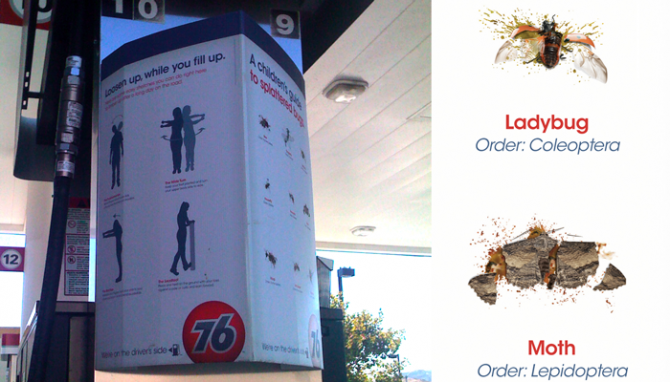
Recently I had the pleasure of keeping my brother company as he drove a U-Haul across half of Arizona and California. After the endless desert dotted with horribly designed billboards along I-10 and the vast nothingness along I-5, our very boring trip was brightened by cute ads at a 76 station.

First I noticed the Children’s Guide to Splattered Bugs at the pump. It was so unexpected that it took a minute for me to realize the flip side wasn’t the same, but another fun sign, Loosen up While you Fill Up, offering much-needed stretching tips. The campaign tagline, We’re On the Driver’s Side, is a clever play on the gas tank arrow. (One could debate this on more political level, but superficially it’s great.)

I did some digging, and it appears this campaign is credited to Venables Bell, and they get props for creating something with just the right amount of levity to catch attention without being over the top. It’s cute, clever, and got me to pull out my iPhone and snap photos. Job well done!

Olivetti

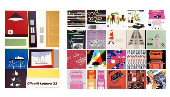
These vintage typewriter ads for Olivetti (shown above)  just blow me away. They are such lovely, illustrated compositions, so different from the full page photo + headline ads of today. Italians certainly know how to design beautiful things, in this case not only the machine but also the ads for it. Illustration is becoming a lost art.

Something I like especially about the Olivetti ads is the focus on the typewriter itself and its functions as art. Showcasing industrial design in this way was unusual. An added bonus is this approach kept the ads from becoming dated in the way so many of its competitors’ ads were, with their appeals to the vanity and simple-mindedness of women.

Of course, this kind of gender bias was par for the cultural course at that time. In the first episode of Mad Men, Joan shows Peggy her desk and remarks that the typewriter looks complicated but that’s it’s so easy a woman can use it. The funny thing is, they have the wrong motivation but the right result — an office machine should, in fact, be designed so that anyone can easily use it.

Mad Men

muse_madmen

Mad Men will soon be back on AMC for its 2nd season. The setting, a Madison Avenue ad agency in 1960, is so interesting to me because it represents a turning point in advertising. Around this time advertisers started embracing conceptual ideas and humor instead of straight pitches, and watching the Sterling Cooper creative team dismiss these newfangled ideas is amusing. In the pilot, they debate the famous DDB Lemon ad for Volkswagen, and most of them don’t get it. That sets up the whole show — this is a group of old white guys about to be hit by a cultural revolution, and they aren’t going to be able to keep up.

Mad Men can be hard to watch at times, as many plot points center around a sexist, racist society that I am thankful not to live in. That’s not to say racism and sexism don’t still exist (see: Election 2008) but at least I don’t live in a time when it’s practically laughable to hire a woman as a writer. Rumor has it the show will resume two years in the future, which I think will be a good move. It allows the characters to experience cultural shifts and to grow emotionally more quickly.

But setting the serious stuff aside, the art direction alone is worth watching this show for: Sharp suits, perfectly tailored dresses, sleek mid-century furniture, intriguing vintage baubles, you name it. Nothing is overlooked.  (Of course, there are times it’s hard to see all this greatness through great clouds of cigarette smoke!)

Great Moments in Advertising

The best part of having a DVR is skipping commercials, but once in a great while something is intriguing enough to make me to stop and rewind. Most reliably I stop for VW, Apple, and the celebrity Geico ads. My favorite Geico spokesperson was Peter Frampton — a little sad for him, but funny for us — until I saw the Mrs. Butterworth spot, which stole my heart. She turns every comment into something about pancakes, syrup, or glass bottles, and the very best moment comes at the end: when the Geico logo comes up on the screen she says “Oh dear, someone has put a logo over my face.” Blatant product cross-promotion aside, it’s hysterically funny.

I don’t know how effective these ads are in terms of generating sales. On the plus side, I’d guess they’ve created major, durable name recognition. I never forget who the advertiser is, which is certainly something funny ads struggle with. (We all remember herding cats, but do you know what the company was?) On the negative side, they have several entirely different advertising campaigns running simultaneously, which makes them look schizophrenic. Also, while the style of the ads skews young, I am not sure if anyone under 30 even gets the jokes. Do they know who Charo, Frampton, or Little Richard even are?

That said, I stop my Tivo to watch their ads and now I’m blogging about one of them. I’d say that qualifies as effective.