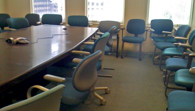
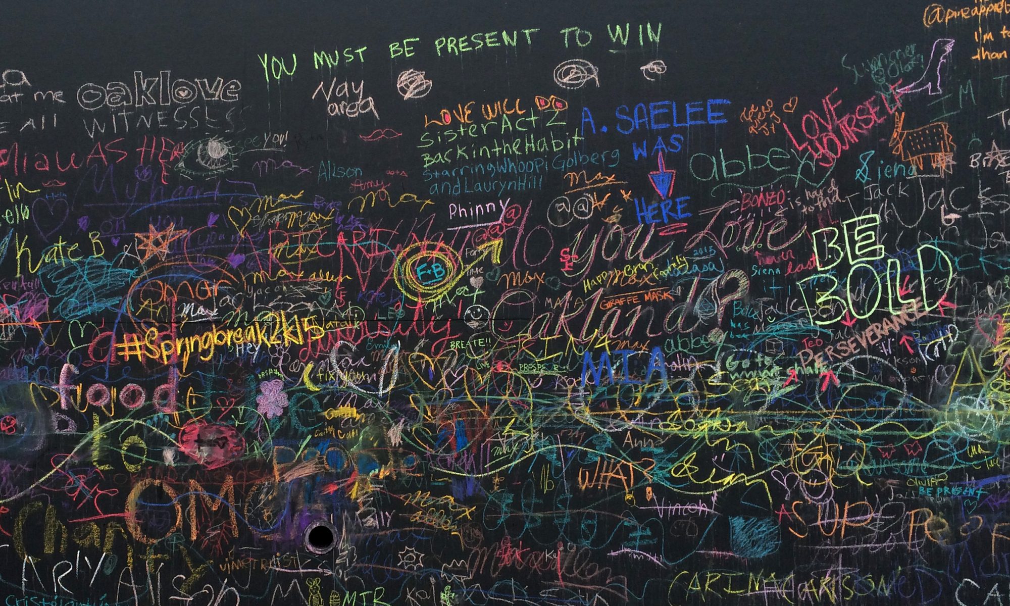
 A client’s main office has a thoroughly depressing interior despite the building’s landmark architecture. The drabness is made all the more noticeable in contrast to their recent brand refresh, which uses great colors and smart messaging.
Every time I visit I think about what a disconnect this is — the employee experience doesn’t match the bright, friendly customer experience they are trying so hard to create. They’ve overlooked the physical environment and employee experience as part of brand alignment, a common mistake.
I thought the endless clusters of beige cubes were the worst of it until I had a meeting in this conference room, which is apparently where teal chairs from the 80s go to die.
