Puppets and pandas


taiwan
This summer is off to a unexpected start!

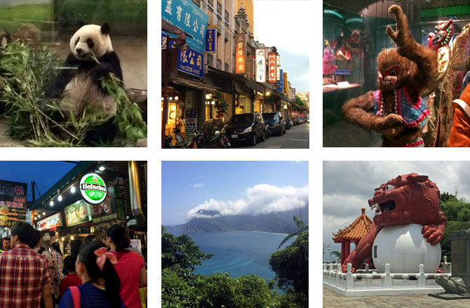
I’ve been advising a good friend and colleague, Michael, on a new business he’s starting. It’s based here in Oakland but with an office in Taipei. He asked if I would go with him on his next trip, which was only a few weeks away, and I jumped at it. I’ve been looking for ways to shake things up in my work and life anyway. Why not see what a couple of weeks in Asia kicks loose? It would also give me an opportunity to piggyback a few days to see family in Tokyo.

The company is confidential, so I can’t say much about that. And I couldn’t possibly cover everything we did and saw in Taiwan. But I can tell you about pandas and gondolas and marble gorges:

Puppets!

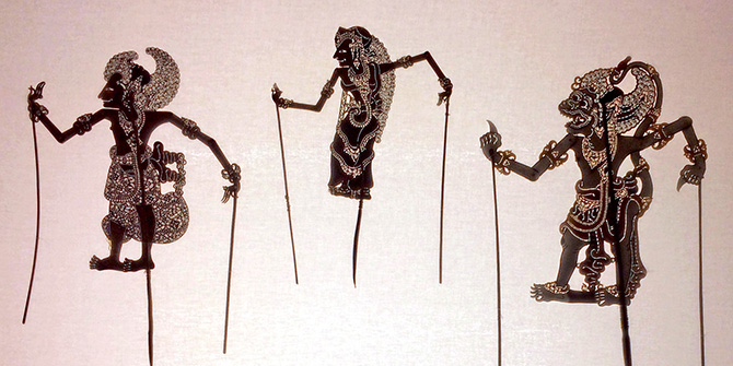
puppetsMichael was over the National Museum after several visits, so our first day there we powered through jet lag and heat exhaustion to go to the Puppetry Arts Center instead. It’s a fantastic little museum packed with inventive, delightful, and even creepy puppets of all kinds. And on the way we visited the beautiful Xingtian temple. It was an inspiring start to our adventure.

Gondolas and pandas

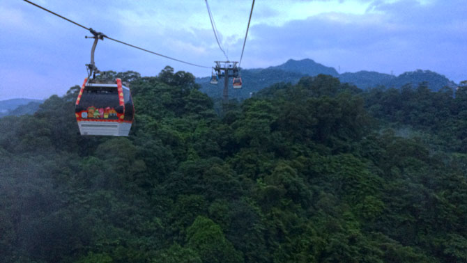
gondolaAfter a business meeting downtown later that week we hustled out to the Maokong Gondolas, only to be foiled by a thunderstorm. It was, frankly, a rough day. Let’s just say mistakes were made and neither nature nor transit were on our side. But serendipity graced us, leading to the famed panda born at the Taiwan Zoo. (Which we could see without waiting since it was 100 degrees and raining. Yay?) And we did eventually get to take our gondola ride at sunset later that day. It was worth the wait — gorgeous and serene. Except for those screeching monkeys after dark.

Taipei 101

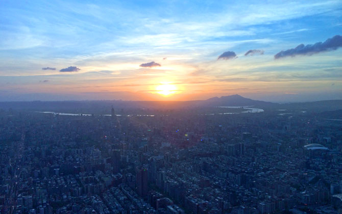
taipei101Something I love doing in big cities is taking in the cityscape. In Taipei, you do this from the observatory at the Taipei 101, one of the tallest buildings in the world. The city is simply huge! It stretches in all directions up to the edges of mountains and rivers. Taipei is a little dreary at ground level, but from above it’s stunning. After the sunset faded we capped our evening with dumplings at Din Tai Fung. Beyond delicious. I’m still drooling over that meal.
Taroko and Sun Moon Lake

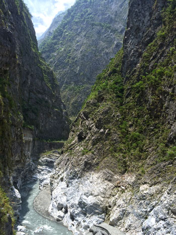
tarokoWe left the city for a few days and saw a prettier side of Taiwan. We started by driving down the eastern coast to Hualien, where we found a great night market and the “coffin bread” I’d been hunting for. The next day we drove across Taroko National Park, starting at sea level and making our way up to the peak at 10,000 feet – where the cool air was a welcome break from the oppressive heat – and wound our way back down and over to Sun Moon Lake in the center of the island. Taroko Gorge is made of marble! Beautiful scenery. Crazy, white-knuckle driving conditions. Michael is a brave man.

Cute overload

My inner 9-year-old was giddy over the omnipresent Hello Kitty. (And my inner brand manager was agog at the volume of licensing deals.) She is everywhere, all the time. As were a million other mascots and characters; clearly the culture of cute rules here. Even the Taipei 101 has a mascot, the “damper baby”, a character based on its spherical wind damper. And Din Tai Fung has a dumpling mascot. Seriously. More on this to come.

Explainers

Exploratorium ExplainersThis weekend a friend was in town, and visitors are great prompts to do all the local things we don’t get around to — in this case, the new Exploratorium!

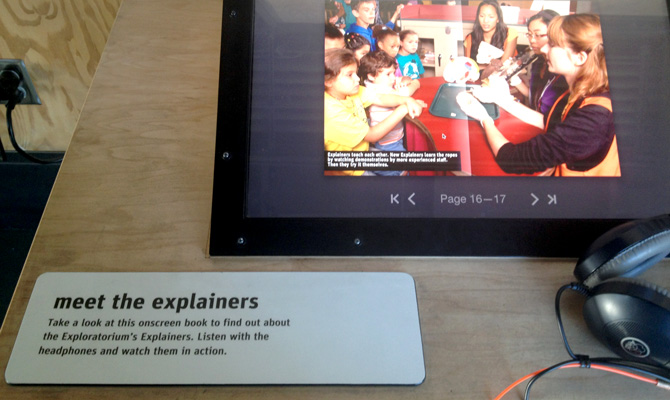
Something that caught my eye is their name for exhibit guides: Explainers. It’s a miniscule detail compared to the immensity and wonder of all the hands-on exhibits, but this struck me as truly the perfect word. In contrast to titles like Docent, Explainer is simple, kid-friendly, and communicates exactly what they do. Bonus points: Exploratorium Explainers is alliterative!

While small, this is a touchpoint that reinforces a playful, thoughtful brand experience.


Subversive landscapes

In the Hung Liu retrospective Summoning Ghosts at OMCA, her emotional, insightful paintings hold unmistakable power. But it was a room of tiny, impressionistic landscapes that riveted me. The room info reads:

“In Maoist China, art was required to support revolutionary ideology and ‘serve the people, heart and soul.’ When Liu began studies in Beijing in the early 1970s, she would often go out alone to the countryside to paint for pleasure. She used small canvases that could fit inside her painting box that she carried in a bag. These bucolic paintings of landscapes, railroad bridges, old factories, and even trash cans and public toilets were kept hidden during the Cultural Revolution for fear their lack of political content could be used against her.”

I love experiences that take what you know and turn it inside out. Historically, nature was a safe subject for artists, containing little social or political commentary that might upset a patron. Artistic style itself has been known to cause a ruckus – just ask the Impressionists that these landscapes coincidentally channel – but, in message, the most a simple landscape might hope to convey is glorifying nature or the pastoral life. Hardly a major offense.

But under a regime that banned intellectual pursuits, art’s only allowed purpose was as propaganda. Not carrying commentary was exactly the problem. Amazing.

Back to 1968

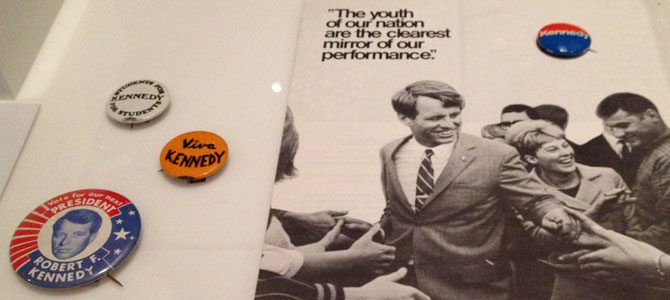
The 1968 exhibit at OMCA is so packed with facts and experiences I needed a second visit to take it in. As years go, it’s hard to imagine many more momentous in modern U.S. politics and culture than 1968, considering the assassinations of King and Kennedy, a pivotal election, the Vietnam War, and countless civil rights clashes.

Balancing the social upheaval were charming artifacts of my childhood. The living rooms were comfortingly familiar, complete with glass grapes on the cabinet TV, mid-century furniture, and World Book encyclopedias. Between the homes of my family and neighbors, every single item was familiar. There were also fun collections of advertising and, naturally, plastic.

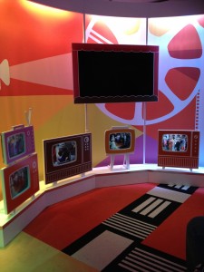
For me the biggest highlight was the TV nook, a nice mood lifter following the Vietnam War exhibit. It doesn’t sound like much on paper — cartoon-like MDF television frames housing clips of movies and shows  — but in execution it was a fantastically engaging, seamless symphony of audio and video. There’s a particularly nice moment in the beginning of the loop where Planet of the Apes melds into the Star Trek voiceover, drama contrasted by the gentle ending of Mister Rogers promising us a smile and a hello tomorrow.

OMCA creates relevant, contemporary exhibits that inspire me. I’m so privileged this is my local museum!

OMCA 1968 RFK

What Do You Think?

Over the past few years I’ve seen many museums trying to create reflective, interactive experiences for visitors. This is an important effort considering the pressures on museums as they fight for financial resources in a downturn, not to mention mind share in an age of digital entertainment.

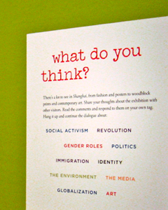
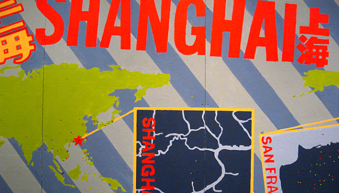
The effort is there, but often the interactive components are not integrated into the exhibits or the museum experience. At the Shanghai exhibit at the Asian Art Museum there was  a small lounge with a few activities such as the prompt pictured, but it was tucked away — nearly hidden — on a separate floor of the museum. Other times, “interactivity” is limited to sending a free postcard or posting a note on a wall.

The best interactive displays I’ve seen locally are at the Oakland Museum of California. My favorite at OMCA is the “Is it Art?” lounge because it addresses an age-old question with a wink. Visitors are lured in by comfortable seating, then challenged to consider their point of view and vote if various objects ranging from a Native American basket to a pink furry thing are “art”. And because you can see the vote tickets in clear plexi containers, you get a sense for the general opinion as well as your own.

Shanghai Exhibit

This week I spent the day in the city with my parents, including a visit to the Shanghai exhibit at the Asian Art Museum. There was no photography allowed, so I couldn’t snap my favorite pieces to show here and I struck out finding them online as well:
  • Shen Roujian, During the Great Leap Forward, 1958
  • Chen Yifei, Morning on the Long Canal, 1995
  • Li Hua, A Corner of the City, 1947
  • Shao Keping, Morning toilet on the Huangpu River, 1961

The biggest surprises for me were the Impressionist and Deco pieces. Deco should not have been a surprise, as it was the first truly global design style. I liked the asymmetry and bamboo motifs, which distinguish it from other regional Deco styles. The most intriguing aspect of the Impressionist work was that much of it was contemporary, yet would have looked right at home hanging next to paintings 100 years older.

The last major point of interest was the cultural debate of “national essence”, the desire to preserve tradition, versus “reformist”, the desire to evolve and revive the art scene by blending new and old. I am a proponent of maintaining tradition, but history has shown time and again that doubling down on the past to the exclusion of all other influences is a losing proposition. A giant painting in the last room was a poster child for this squabble, with some critics arguing it could not be considered contemporary simply because it uses a traditional medium. It seemed like a purely academic argument, because it was obvious to me that this emotional, abstract painting was inarguably contemporary in its composition and style. I thought it was an excellent example of blending the past and present into something progressive but still indelibly Chinese. Then again, what do I know? I’m not a critic.

Defining Art

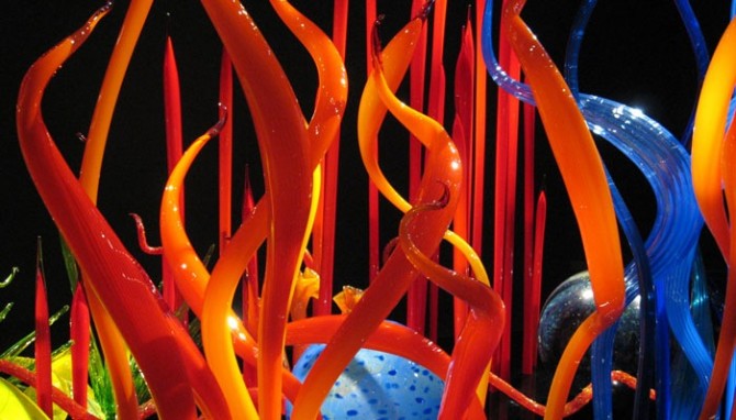
Last weekend there was a highly critical article about the Chihuly exhibit at the De Young that really got my back up. The money quote:
“The history of art is a history of ideas, not just of valuable property. Chihuly has no place in it, and the de Young disserves its public by pretending that he does.”

I have my own criticisms of Chihuly — primarily that his work can be overly gilded and that commercial success has led to excessive repetition — but there are ways to critique an artist without declaring his work isn’t art. The author’s main arguments seemed to be that the exhibit is a spectacle and not serious enough, and that Chihuly’s work is too flamboyant and decorative to be considered “art”.

The former is more than a little puzzling. Yes, the exhibit is a spectacle and the gift shop is indeed “barnacled” on. But this criticism could easily be made of much modern culture and art, and it is unfair to single Chihuly out. His work is flamboyant and showy, but that just makes a theatrical exhibit seem all the more authentic. On the other hand, despite the spectacle the author claims “educated viewers” will get bored because is not enough intellectual content to hold their interest. That must mean I’m not educated, because there were plenty of beautiful visuals to keep my attention.

It’s also seriously misguided to claim that art must be high-concept. We do have rough categories of fine art, decorative art, craft, and the like, but the lines are blurry at best. Going by the author’s yardstick, we’d have to disregard half of the “history of art”! Dutch and Flemish masters are a good example — the technique is remarkable, but in the end it’s often just a painting of of a dead rabbit, a rich patron, or a vase of flowers. Where’s the intellectual statement there? And yet we don’t question those paintings as art.

Perhaps more importantly than how he defines art is the arrogance of claiming to define art for others. As the resident creative in my family I spend a lot of time defending art, and I think it’s important to take a broad view of it. If it expresses something, even if I don’t like or understand it, it can still be considered art. You don’t have to like it or agree with it, but it’s generally not appropriate to define someone else’s experience. That’s not to say you can’t ever draw a line, but you should draw it as generously as possible.

The entire article felt like a thinly veiled assertion that if the masses like it, it can’t be art-with-a-capital-A. Enough people already question and dismiss art without elitism like this to alienate them further. It occurs to me artists complain art isn’t appreciated, but often they seem to work very hard at preserving image of the starving, misunderstood artist. After all, if the plebeians get it, it can’t be any good.

Genius

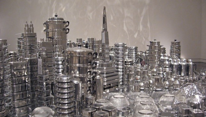
Zhan Wang’s stainless steel sculpture of San Francisco was an impressive installation, even though it was hard to visually sort a sea of shiny stainless steel and in a few places it felt like the artist ran out of steam and just started throwing in extra tea kettles.
What I like most about it is how accessible it is. Even if a viewer is not interested in the sociopolitical theme, they can still appreciate it visually and admire the ingenuity behind it. Everyone I saw enter the room spent at least 10 minutes looking at it, and some even talked to each other about it. Art that inspires people to become engaged and discuss it with strangers is the best kind.

I also love that once it’s dismantled, the pieces can be reused for another sculpture or be used as originally intended.

Glass Raindrops

The de Young and the Asian Art Museum are arguably the best art museums in San Francisco, although the bar is not as high here as I would like.

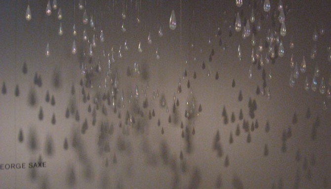
The installation shown above is by Kiki Smith, and it was commissioned specifically for this space at the de Young. I didn’t see it overhead when I was below in the room (maybe I was distracted by the upside-down dog planter bed by Chihuly). Rather, I found it by accident when I was in another gallery and became curious about an overlook at the end of the hall. There is a second hanging sculpture that is a part of this one, but the glass teardrops felt very separate to me and I only saw them as a whole in the shadows on the wall. At the time I thought it is not a good sign about a collection when the best thing in it is shadows. However, after some research I learned the artist fully intended the shadow play, so perhaps it’s simply the best piece in the room. It takes a little bit of work to find the second-floor viewing balcony, but it’s worth it to see this piece.

Genius

I can’t wait to see this sculpture in person! The city of San Francisco, replicated in stainless cookware. What’s not to love? I especially love the interpretation of docks and piers. From the Asian Art Museum site:

“For his exhibition at the Asian Art Museum, Wang has selected rocks from the foothills of the Sierra Nevada, alluding to the nineteenth-century Chinese immigrant experience of mining gold during the California gold rush. Both the actual rocks and their stainless steel versions will be exhibited. The artist will also create a topographic San Francisco cityscape–one of his ‘urban landscape’ series– using steel rocks, mirrored surfaces, silverware, and stainless steel pots and pans.”