Friday I gave a brief speech at a Designers Accord town hall event “Design Change, Change Design” hosted at California College of the Arts and organized by Design Strategy MBA students Ahmed Riaz, Elysa Soffer, and Mike Funk.
My talk was geared at designers who want to work towards social good but aren’t sure how, and it was inspired by The Power of Unreasonable People by John Elkington and Pamela Hartigan. A fellow speaker also brought the Unreasonable Institute to my attention, which is based on the same idea.
A short version of my speech follows.
My goal in life is to be an unreasonable person.
It’s true most of the time people need to be more reasonable, not less — but reasonable people don’t change the world. A quote from George Bernard Shaw:
“The reasonable man adapts himself to the world around him, where the unreasonable man persists in trying to adapt the world to himself. Therefore, all progress depends on the unreasonable man.”
To make a change in the world, we have to be unreasonable — we have to believe in things that most people think are pointless, or crazy, or impossible. At an event about “design for social good” it’s safe to assume many of you are already pretty good at this. But for those just getting started, here are 5 ways designers can be unreasonable:
1) Push back
The first step to being unreasonable is challenging the design parameters you are given. Even if they were written by a boss, client, or someone you think is smarter than you are doesn’t mean they’re right. Designers have a pivotal role as the gatekeepers to “stuff” — messages, products, processes — and they can use this to influence what is produced.
Ask basic questions: Is this the right solution, or even the right problem? Does it have to be done with this material or process? If you can, add your voice and improve the outcome. And even if you can’t, sneak in improvements. I had a client who didn’t like the idea of recycled paper even though he couldn’t tell the difference, so I simply didn’t tell him the paper he approved was recycled. Problem solved.
2) Just say No
Once you’re used to pushing back, stop working with clients or projects that are harmful. Tell your boss you won’t work on certain accounts, or turn down projects or clients if you have that power. Yes, it’s scary and risky. That’s why it’s unreasonable.
3) Believe you are the only one who will solve the problem
Reasonable people think others — people, governments, corporations — are working on the world’s problems. You may even be thinking that you aren’t business savvy, smart, or qualified enough to make a difference. But designers are, by definition, trained to solve problems. You’re exactly the right person to identify a need and find a way to meet it. Keep in mind you don’t have to have a big idea yet. Just keep your eyes open and needs will appear in your own backyard.
4) Find profit where others think there is none
Once you found your opportunity, become a social entrepreneur. Social entrepreneurs are the very definition of unreasonable, bucking common wisdom by finding creative ways to create economic gain alongside social good and refusing to accept they have to choose between doing good and making a good living. Just because no one else has figured out how to solve a particular problem and make money at the same time doesn’t mean you can’t. Figure it out!
5) Sell out
As a social entrepreneur you may have formed an entire community of unreasonable people working outside the system, and all of these ideas start seeming…very reasonable. In this group, perhaps the most unreasonable thing you can do is go back inside the belly of the beast and become a social intrapreneur instead. Going back to point #3, believe you are the person who can change a mega-corp like Monsanto from the inside. I’ve taken a few potshots at Adam Werbach for working with Walmart and selling his agency to a media conglomerate, but he’s right that a micron of change by Walmart can create a larger measurable result than everything else combined.
For more about social entrepreneurship and what it means to be unreasonable, I highly recommend reading The Power of Unreasonable People.
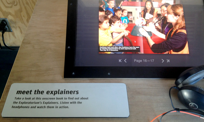 This weekend a friend was in town, and visitors are great prompts to do all the local things we don’t get around to — in this case, the new Exploratorium!
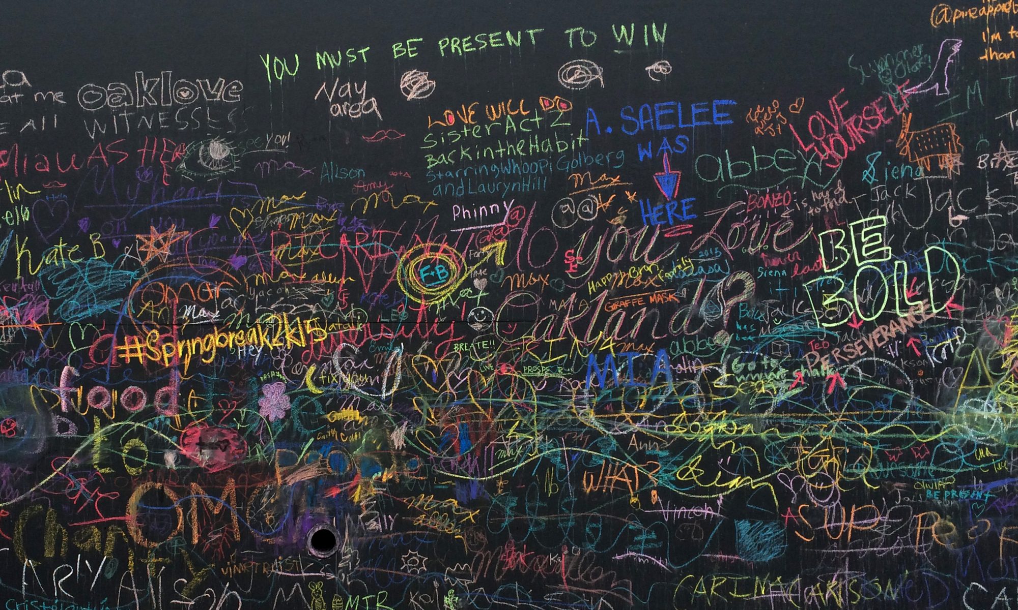
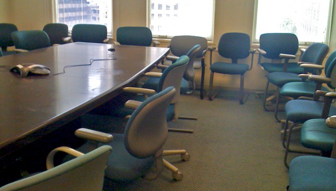 A client’s main office has a thoroughly depressing interior despite the building’s landmark architecture. The drabness is made all the more noticeable in contrast to their recent brand refresh, which uses great colors and smart messaging.
 For my elective class this semester I chose Mythology, Meaning, and Design, an exploration of myths, archetypes, and symbols and how they continue to play out today in modern storytelling such as media and branding. So far it’s a very demanding class — more than an elective is worth, probably — but I’m having fun with it.
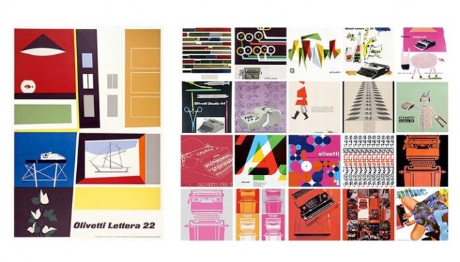 These vintage typewriter ads for Olivetti (shown above) just blow me away. They are such lovely, illustrated compositions, so different from the full page photo + headline ads of today. Italians certainly know how to design beautiful things, in this case not only the machine but also the ads for it. Illustration is becoming a lost art.
 The de Young and the Asian Art Museum are arguably the best art museums in San Francisco, although the bar is not as high here as I would like.