Visiting Wes Anderson’s Desert Dream

Review: Wes Anderson's Asteroid City | Time

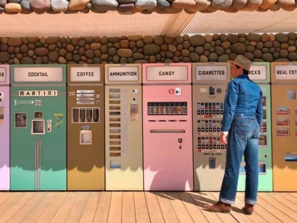
Don’t be surprised if you walk into my house one day and find that it feels a little like Wes Anderson’s Asteroid City. (I’m halfway there already with my color palette.) It’s a film worthy of many rewatches, not for the story but to live in that creamy, dreamy, surreal desert diorama for another hour and forty-five minutes.
Wes Anderson's New Film Takes Inspiration from This Quaint Madrid Town -  Softonic
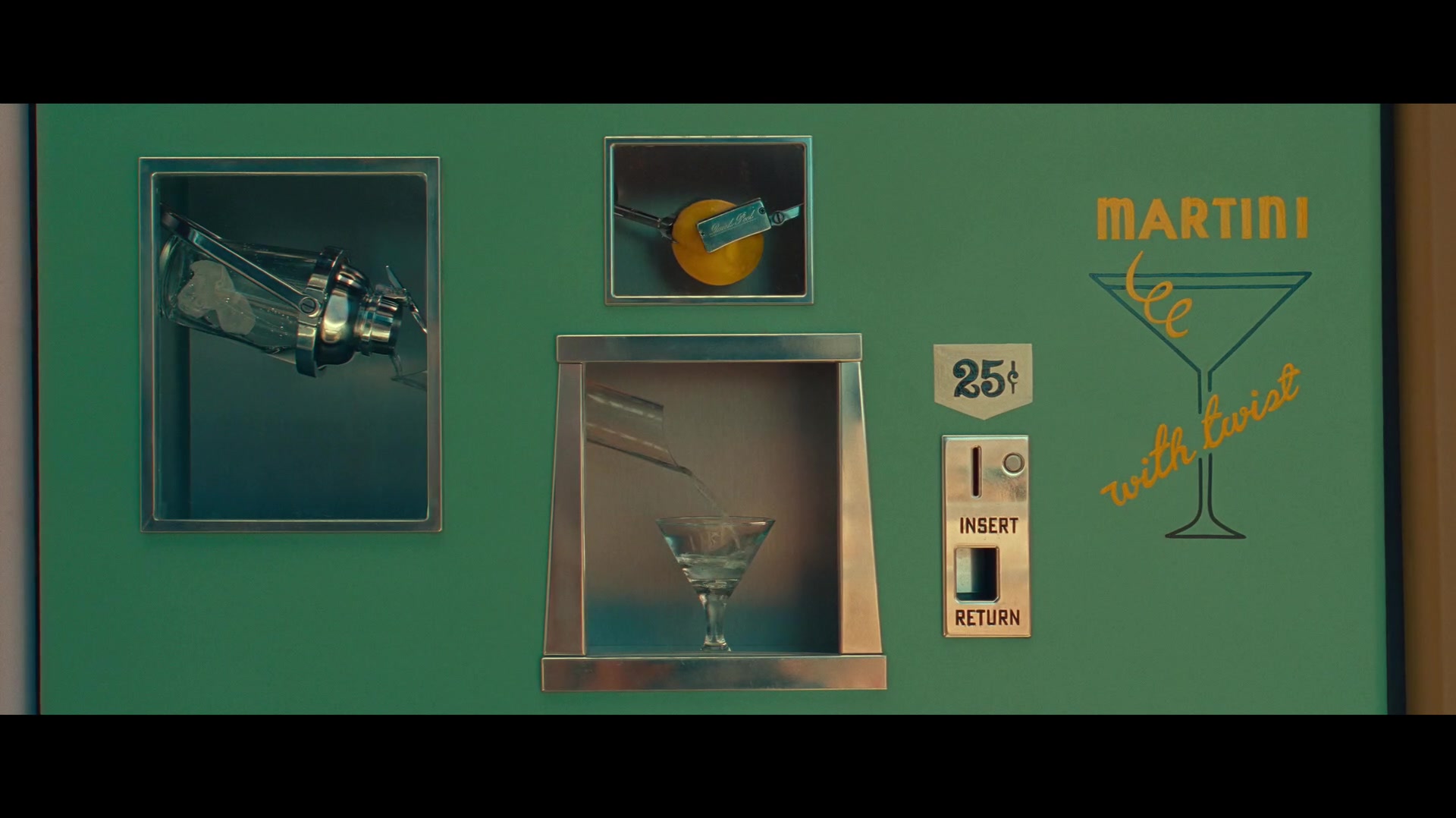
Martini With A Twist In Asteroid City (2023)

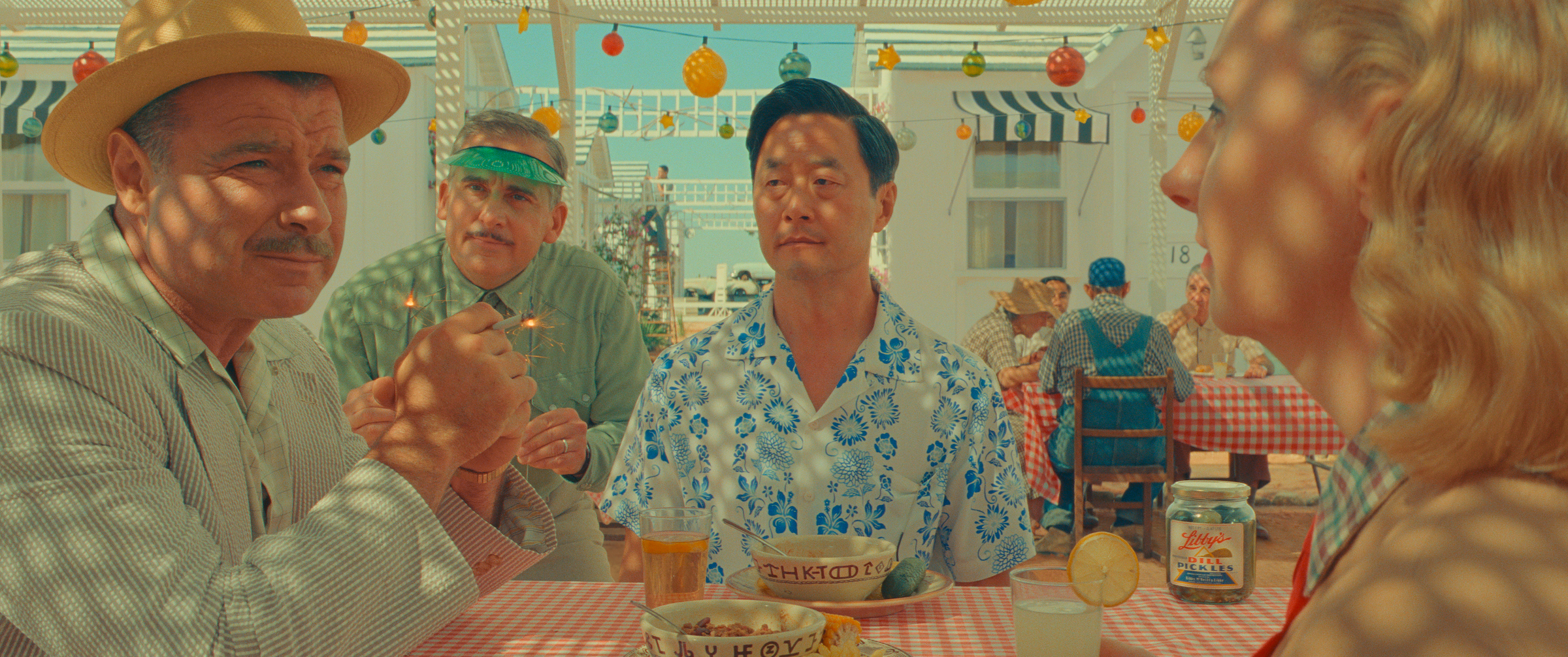
The desert is my soul home, so I’m a sucker for the landscape and motifs as it is. But from the gorgeous suite of colors to the Looney Tunes backdrop, the creative direction of Asteroid City is truly stunning. It’s a work of art. Every frame is a beautiful, dynamic composition. The costuming signals character and builds an immersive world. There’s whimsy in every vending machine, auto shop prop, and road to nowhere.

I was especially taken by the lighting, which is overwhelmingly bright yet lush — not surprising as they used the sun as a primary light source. There’s a picnic scene staged under a lattice pergola, casting dappled light on the conversations. It’s not only visually interesting, but there’s something about the grid of shadow and light…half hidden, half exposed…checkered. Can’t quite put my finger on why this feels so important. Maybe I don’t have to explain it, it’s okay to simply enjoy it.

Off to rewatch!
Hello Kitty, hello cuteness

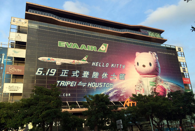
hellokittybillboardOn my recent trip to Taiwan and Tokyo, the cute factor was inescapable. Buildings, restaurants, museums, you name it. Everything has a mascot. Everything has an animated character. And the queen herself, Hello Kitty, continues to reign supreme.

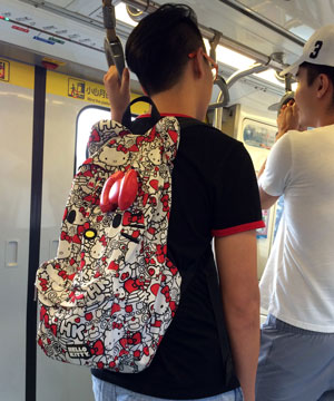
But of course Hello Kitty is more than a mere character. She’s a phenomenon and even a way of life, and has been for 40 years. Even guys can be spotted with HK gear. (Full disclosure: I still have the plush Hello Kitty I got in the 4th grade.)

hellokittybackpackOur trip coincided with the debut of the new EVA Air Hello Kitty route to Houston. The subway and street ads feature Kitty as an astronaut, which makes sense. Why she carries a basketball, I couldn’t say. Maybe the Taiwanese are crazy about the Houston Rockets?

These themed routes have special planes decked out in Hello Kitty from tip to tail. It has to be seen to be believed. The depth and detail is truly astonishing — in addition to the plane wraps, there are more than 100 Hello Kitty branded items inside the plane, from the lavatory soap to the food to the toilet paper. EVA Air has even redesigned its airport counters and kiosks to promote the collaboration. It’s like a a giant Sanrio store.

I can’t even wrap my head around the amount of work and money this must have taken to build out. The licensing and contracts alone, much less the design, printing, and manufacturing costs to duplicate everything on a plane… amazing. They report it’s expensive, but profitable.

That is what you call brand equity.

Packaging for Dummies

I laughed when I saw this. Part of me wants to be offended by packaging that assumes our incompetence, but considering how many times I’ve overlooked or mangled a resealable strip I have to admit it’s spot-on.

open_here

Earthquake mashups

Shawn Clover, 1906 + Today: The Earthquake Blend

This photo mashup series by Shawn Clover that merges images from the 1906 earthquake and San Francisco today is a fantastic concept, with stunning execution.

From the artist:

To put these photos together, I first create a catalog of historical photos that look like they have potential to be blended. Unfortunately most of these photos end up on the digital cutting room floor because there’s simply no way to get the same photo today because either a building or a tree is in the way. Once I get a good location, I get everything lined up just right. My goal is to stand in the exact spot where the original photographer stood. Doing this needs to take into account equivalent focal length, how the lens was shifted, light conditions, etc. I take plenty of shots, each nudged around a bit at each location. Just moving one foot to the left changes everything.

I am in awe.

Library a-Go-Go

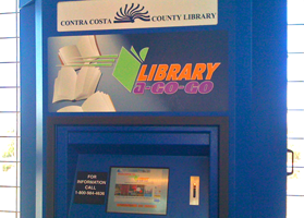
Out at the farthest edges of the Bay Area in Contra Costa County, I saw this amazing mini-library in a BART rail station. From the library web site:
“Library-a-Go-Go is an automated book dispensing machine. It’s a self-contained collection of books that allows Contra Costa County Library card holders to borrow library books and return them when finished.”

The selection is probably quite limited and it doesn’t replace the library browsing experience, but it is a fun idea. Sort of a modern Bookmobile. I like the convenience of being able to get or drop a book on the way to work, and anything that improves library use and access is a good thing. I just hope it actually gets used — the decline of libraries is such a shame.

Don’t Litter!

Why is it that people have to be told not to litter?
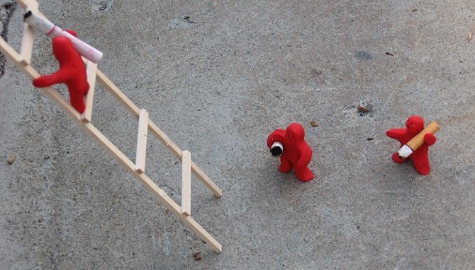
A CCA grad student created a small set of installation pieces, evidently as a statement against cigarette-butt litterbugs. In this scene, a series of little clay men carry inappropriately discarded butts from the base of a tree, across the concrete, up a ladder, finally depositing them in an ash tray on a bench. In another scene, the red figures have erected a fence around a storm drain, drawing attention to the “No Dumping” signs.

Barcelona

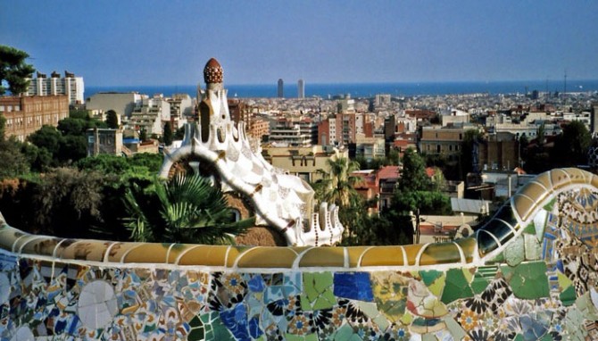
After 5 long years, I’m finally getting around to organizing my Europe photos. I’m starting with Barcelona, a city that stole my heart.

Gaudi has a lot to do with why I loved Barcelona so much — his work is whimsical, colorful, and imaginative in a way that makes me wonder if hallucinogens were in vogue at the time. Every inch of this town is covered with textures and patterns and it was incredible to be enveloped so completely by detail. Even when it was too much (as Gaudi often is) it made me giddy to be in a city that lives and breathes design this much.

What I loved most was how the mundane — chimneys, attic ceilings, benches, vents — was transformed into the exotic. Form follows function, of course, but I see no reason why everything practical can’t also be whimsical or elegant.

I Heart Tastespotting

Tastespotting compiles the best in food blogging from all over the world, making it the ultimate in food porn and a very amusing way to waste a bunch of time. Whether you’re looking for ideas about what to cook or just want to admire others’ creativity and talent, this is the place.

In the “OMG That’s Brilliant” category today, we have a pretzel diamond ring, by Roni Baram of the industrial design department at H.I.T, Israel on the left. Top right we have sugar people, waiting to be knocked into to their watery (or coffee-y, rather) graves from Natasha at Nova Clutch.

And the “Food Worth Drooling Over” category is being represented by the Beef Wellington on the lower right, courtesy of Mike’s Table. My nitpick here is it should be made with brioche, not puff pastry, but who am I kidding? It looks fantastic and I’m jealous. The best story of my childhood is how I requested my parents make me Beef Wellington for my birthday…when I was 4.