Fun with Visualizations

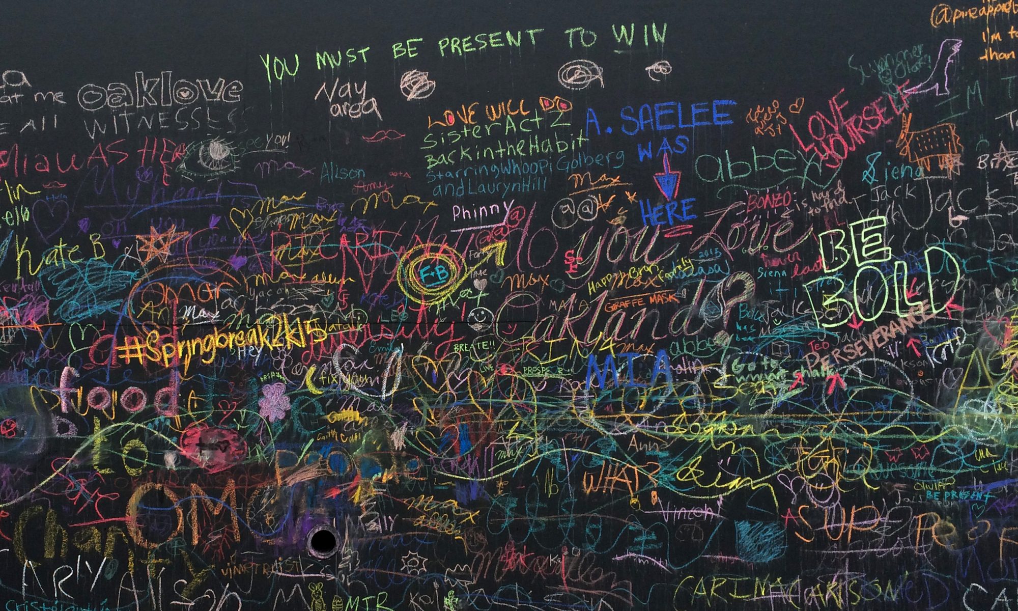
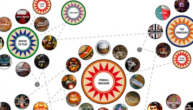
The image above is a detail from a poster I have been working on for my Mythology pinball project. I was having such a good time learning about the visual language of pinball that I got a little carried away on this poster — this is the kind all-consuming project that makes it hard to get any other work done!

Something I’ve discovered in the MBA program is how much I love creating process diagrams and visualizations. I spent many years as visual designer, but my experience was largely designing identities and content rather than ideas and processes. Getting more experience with this kind of visual documentation has given me a larger set of tools for sorting information and finding relationships between ideas. Plus, it’s fun!

Play That Silver Ball

For my elective class this semester I chose Mythology, Meaning, and Design, an exploration of myths, archetypes, and symbols and how they continue to play out today in modern storytelling such as media and branding. So far it’s a very demanding class — more than an elective is worth, probably — but I’m having fun with it.

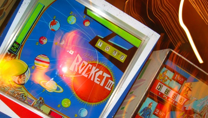
For our second module I’m investigating of the experience of pinball: why people love the game and why there has been a small recent revival. Conveniently, the Pacific Pinball Expo just took place, and in Alameda there is a local pinball palace/museum, Lucky JuJu, so I have been able to observe players in their natural habitat.

The most surprising discovery has been the charming art of pinball. Before licensed themes became dominant (the era I played in as a child) there were decades of beautiful graphic art exploring every pop culture theme from science fiction to sports to the Old West. (Hmm, see any myths there?) Rows of seemingly endless machines displayed an incredible collection of this unique but endangered American art form

So far in this project I’ve created an epic pinball infographic that think may be portfolio  material. Next, for the branding portion of the project I’m considering designing a beer company with the pinball art as a centerpiece. Can’t wait!

Seeing the forest for the trees

Recently I got back in touch with a friend from high school, who has become an art teacher and an impressive photographer. Her photographs show patient experimentation and scene staging that result in charming, dynamic images.

I appreciate how she explores all aspects and dimensions of a scene to find her shot and uncover the happy accidents. It’s tempting to stop after one, two, or even three good ideas due to competing priorities and limited billable hours. Innovation comes from persisting past the easily seen to find less expected, hidden treasures.

In my professional work, the angles and the subject are on opposing ends of a seesaw. Spend too much time focusing on the details and you might miss the idea that wraps them all together, but if you don’t spend enough time exploring the details you won’t have learned important facets that increase your understanding of the subject.

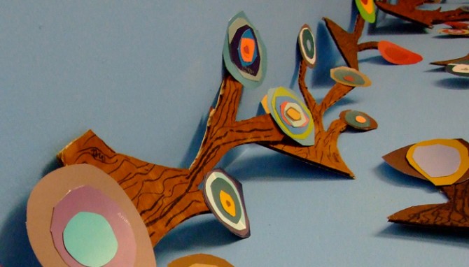
Above is a class project her students have been working on, creating a wall-sized forest of Kandinsky trees. I love it!

Photo by Sina Evans.

…Put up a parking lot

I live in downtown San Leandro, California, a city east of San Francisco that is more like a small town than a suburb. It’s one of the most walkable areas I’ve ever lived  — better than my neighborhoods in SF and Chicago, even — and the city is working hard to develop the downtown core as a transit village.

The newest target of redevelopment is former Albertson’s grocery store, Lucky before that, which sat empty for years after more than 55 years in operation. After Albertson’s pulled out, the city failed to lure a Trader Joe’s and then the neighborhood blocked two discount chains who wanted the space. The fight between those who want to gentrify downtown and those who want to bring in retailers that would serve the working-class locals is a familiar tug of war.

Fenced off and neglected, the abandoned store has long been an eyesore, a constant reminder of a struggling city in a tough economy. As I learned when researching a food project, empty grocery stores are a particular challenge to re-let — they have an architecture and square footage that is unique to grocery stores, yet other grocers are wary of taking on a failed space. After many tanked plans and heated discussions, the city has purchased it to use as a temporary parking lot while they rebuild a downtown garage. After that, they will attempt to find retailers to anchor a mixed-use space. I can only hope by then the economy will have strengthened and other city development plans will have taken strong enough root to support it.

The company in charge of the demolition claims to be “environmentally conscious”, recycling 75% of materials generated and properly handling toxins. It’s such a specific claim it makes me wonder if this is unusual, or if most firms do it but don’t talk about it. After all, they are paid for scrap and charged for landfill runs so it would be logical for most demolition companies to encourage recycling at a minimum. On the other hand, I have watched firsthand as a construction crew junked leftover, whole pieces of expensive material. Even if the owners and contractors don’t support waste, this ethic may not trickle down the the workers who simply want to get the site cleared as fast as possible.

The Fox

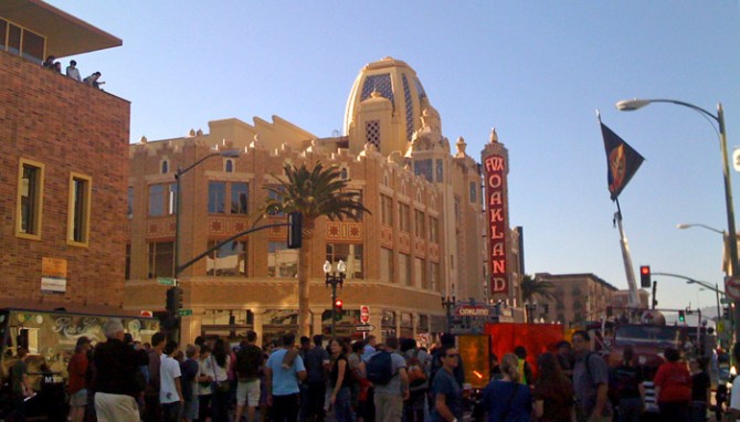
Downtown Oakland has an impressive Art Deco presence, and some neglected gems have recently been renovated, including the Fox Theater, built 1928. The interior is stunningly intricate with opulent details drawing from Moorish and Baghdadian motifs, among others.

As luck would have it, on the momentous day I was able to get inside this amazing landmark I forgot my camera! The iPhone can get a decent daylight shot (above) but the dark interior was beyond its limitations. I don’t know how or when I will be able to get back inside the theater to take more photos, but I’m hoping to have that chance because it truly is amazing. Although there is every chance I could never take photos as beautiful as the ones on Nathan Bennett’s site.

Sustainable Brands

In June I was able to attend part of the Sustainable Brands 09 conference in Monterey. Some conference highlights:

Corporate iguanas

My favorite moment of the conference came with the reference by Dev Patnaik to “Corporate Iguanas”. The reptilian brain has no empathy or social awareness, which leads reptiles to “treat each other like furniture” and eat their own. That certainly does sound like a few corporations I know.

People who need people

The social and organizational sides are often left out of the sustainability conversation, presumably because the environmental stuff is easier to measure and understand. However, People is indeed one of the 3 Ps so I was heartened to see Frito-Lay includes Talent as a major part of their sustainability strategy. Creating a sustainable organization relies on the ability to attract and retain the best employees.

Proverb from the Sun Chips guy

If you want 1 year of prosperity, plant corn.
If you want 10 years of prosperity, plant trees.
If you want 100 years of prosperity, educate people.

Apathy

Jez Frampton of Interbrand says 95% of customers would consider buying green products, but only 22% do — that’s the opportunity space. (I thought this was contradicted by another number that stated somewhere north of 10% actively refuse to buy green, so how can 95% consider it?) He also said only 42% of CEOs say sustainability is on their agenda and only 19% of boards say so. Nice to see the boards are taking their oversight responsibilities seriously. I was disappointed that Frampton’s discussion about expressing the lifetime impact of buying a BMW somehow stopped at ownership, overlooking end of life entirely.

Effecting change

At the end of day 2, I finally saw a system map! (I have an unnatural love of system diagrams and process graphics.) A consultant working with Starbucks brought together all the coffee cup stakeholders, from Dow through the municipal recycling facility, and familiarized them with each other and how they interconnect. An important takeaway was that even though there may be parts of the system that have a larger impact, the party that feels the pain is the one who will make the change. In this case, it’s Starbucks that is doing the work because it benefits from or is punished by the sustainability PR.

Familiar faces

It was nice to be at a conference where I know people! The MBA in Design Strategy program was well represented by our program chair, Nathan Shedroff, who was speaking, plus another instructor and a big handful of our guest lecturers. This conference was a very friendly bunch, much more so than design conferences I have attended, and our program gave me a good opening to talk with strangers.

The speaker from IDEO, Owen Rogers, seemed familiar and I realized we were at a workshop together in Kansas City 7 years ago! That workshop was one of my first encounters with Nathan, too.

Olivetti

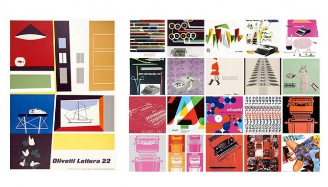
These vintage typewriter ads for Olivetti (shown above)  just blow me away. They are such lovely, illustrated compositions, so different from the full page photo + headline ads of today. Italians certainly know how to design beautiful things, in this case not only the machine but also the ads for it. Illustration is becoming a lost art.

Something I like especially about the Olivetti ads is the focus on the typewriter itself and its functions as art. Showcasing industrial design in this way was unusual. An added bonus is this approach kept the ads from becoming dated in the way so many of its competitors’ ads were, with their appeals to the vanity and simple-mindedness of women.

Of course, this kind of gender bias was par for the cultural course at that time. In the first episode of Mad Men, Joan shows Peggy her desk and remarks that the typewriter looks complicated but that’s it’s so easy a woman can use it. The funny thing is, they have the wrong motivation but the right result — an office machine should, in fact, be designed so that anyone can easily use it.

Leadership by Design(ers)

We’ve finished our first year on the Design Strategy MBA program! It’s hard to believe. In December I wrote a post for Triple Pundit making the case for how thinking like a designer has a lot in common with being a good leader. It seems like a fitting end to the school year to re-post it here.


The business world has started to recognize something I’ve thought for a long time — designers have exactly what it takes to be great leaders. Here’s why:

We turn vision into reality.

Arguably the most powerful design skill (and the most underestimated, even by designers) is the ability to take abstract concepts and express them tangibly through visuals, messages, and models. We’re innovative at heart, and we bring the new and unusual to life in inspiring ways and show people things they couldn’t have imagined themselves.

We play well with others.

Designers work well independently, yet we also have the emotional intelligence and curiosity it takes to thrive in collaborative groups. We welcome input from those who will show us different perspectives, give us inspiration when we are stuck, criticize us when we can no longer see clearly, and push us to improve our work in ways we cannot achieve alone.

We see the big picture.

The best designers have a broad understanding of history, culture, and people, which gives us the perspective needed to see the long-range vision and give it context. We explore connections between unlikely things and weave those threads together into compelling stories that resonate.

We sweat the details.

I’ve never met a good designer who wasn’t obsessed with details! That level of attention can seem over-the-top, but consistent details are what provide the depth necessary to build up an idea and turn it into a rich, seamless experience.

We take work personally.

Regardless of what people say it’s rarely “just business”, especially when your business is creation. We are passionate about ideas, and the emotional investment we have in our work drives us to improve and learn constantly.

We are committed to sustainability.

Designers are on the front lines of the green revolution, perhaps because we have designed, built, and packaged so many wasteful things. Through communities like the Designers Accord, we are using our unique position to make a positive impact on the world.
Tone Deaf

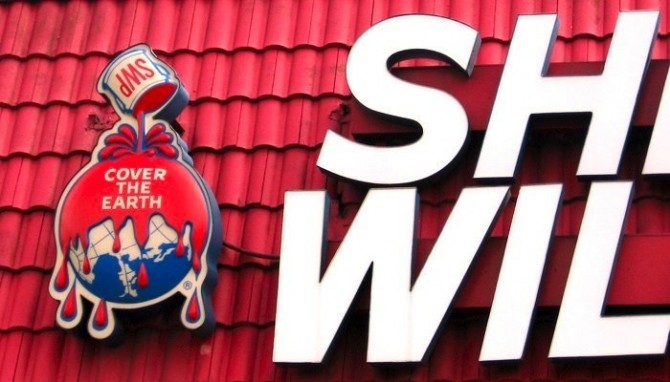
Recently I was astonished to see this Sherwin Williams logo, which I assumed old signage. Seriously, who in the world would think this logo is a good idea? I was wrong. This very old mark — which, to its credit, looks decades newer than its pre-1900 origins — is in fact still the approved Sherwin Williams logo. How have I never noticed this before?

It’s easy to imagine an ambitious young paint company loving the original idea: “Wouldn’t it be great if we could paint every building in the world with our revolutionary standardized paints?” But in the current context of environmental awareness, the intent is overshadowed. Even if you overlook the bloodiness of the paint they are still, quite literally, pouring toxic paint over the earth.

Paint that ends up down drains and in landfills is a hazard to environmental health and water supplies, and this image gives the worst possible impression of their attitudes towards corporate responsibility. I can hardly grasp what must be flat-out stubbornness behind the decision to stand by this logo. More companies should honor their brand history, but this is simply an absence of good sense.

In branding, your intentions don’t matter; what matters is what people perceive. Sherwin-Williams has a statement defending the mark and their sustainability initiatives, but refusing to acknowledge public perception is a colossal branding misstep.