Fun with Visualizations

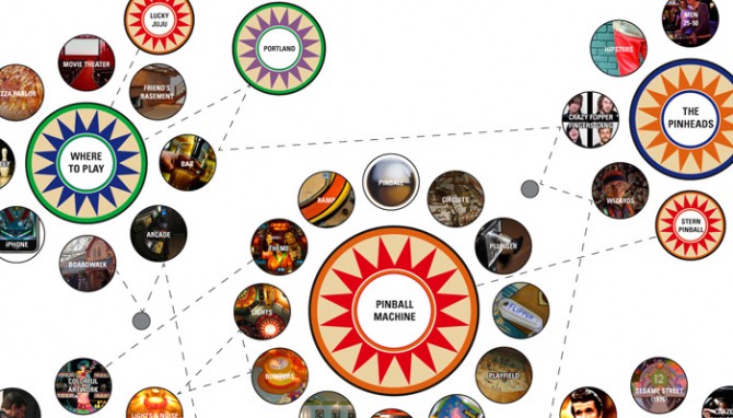
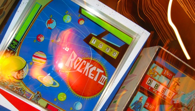
The image above is a detail from a poster I have been working on for my Mythology pinball project. I was having such a good time learning about the visual language of pinball that I got a little carried away on this poster — this is the kind all-consuming project that makes it hard to get any other work done!

Something I’ve discovered in the MBA program is how much I love creating process diagrams and visualizations. I spent many years as visual designer, but my experience was largely designing identities and content rather than ideas and processes. Getting more experience with this kind of visual documentation has given me a larger set of tools for sorting information and finding relationships between ideas. Plus, it’s fun!

Play That Silver Ball

For my elective class this semester I chose Mythology, Meaning, and Design, an exploration of myths, archetypes, and symbols and how they continue to play out today in modern storytelling such as media and branding. So far it’s a very demanding class — more than an elective is worth, probably — but I’m having fun with it.
For our second module I’m investigating of the experience of pinball: why people love the game and why there has been a small recent revival. Conveniently, the Pacific Pinball Expo just took place, and in Alameda there is a local pinball palace/museum, Lucky JuJu, so I have been able to observe players in their natural habitat.

The most surprising discovery has been the charming art of pinball. Before licensed themes became dominant (the era I played in as a child) there were decades of beautiful graphic art exploring every pop culture theme from science fiction to sports to the Old West. (Hmm, see any myths there?) Rows of seemingly endless machines displayed an incredible collection of this unique but endangered American art form

So far in this project I’ve created an epic pinball infographic that think may be portfolio  material. Next, for the branding portion of the project I’m considering designing a beer company with the pinball art as a centerpiece. Can’t wait!

…Put up a parking lot

I live in downtown San Leandro, California, a city east of San Francisco that is more like a small town than a suburb. It’s one of the most walkable areas I’ve ever lived  — better than my neighborhoods in SF and Chicago, even — and the city is working hard to develop the downtown core as a transit village.

The newest target of redevelopment is former Albertson’s grocery store, Lucky before that, which sat empty for years after more than 55 years in operation. After Albertson’s pulled out, the city failed to lure a Trader Joe’s and then the neighborhood blocked two discount chains who wanted the space. The fight between those who want to gentrify downtown and those who want to bring in retailers that would serve the working-class locals is a familiar tug of war.

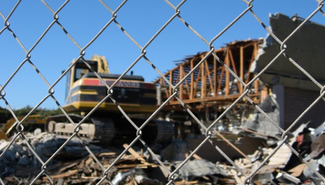
Fenced off and neglected, the abandoned store has long been an eyesore, a constant reminder of a struggling city in a tough economy. As I learned when researching a food project, empty grocery stores are a particular challenge to re-let — they have an architecture and square footage that is unique to grocery stores, yet other grocers are wary of taking on a failed space. After many tanked plans and heated discussions, the city has purchased it to use as a temporary parking lot while they rebuild a downtown garage. After that, they will attempt to find retailers to anchor a mixed-use space. I can only hope by then the economy will have strengthened and other city development plans will have taken strong enough root to support it.

The company in charge of the demolition claims to be “environmentally conscious”, recycling 75% of materials generated and properly handling toxins. It’s such a specific claim it makes me wonder if this is unusual, or if most firms do it but don’t talk about it. After all, they are paid for scrap and charged for landfill runs so it would be logical for most demolition companies to encourage recycling at a minimum. On the other hand, I have watched firsthand as a construction crew junked leftover, whole pieces of expensive material. Even if the owners and contractors don’t support waste, this ethic may not trickle down the the workers who simply want to get the site cleared as fast as possible.

Olivetti

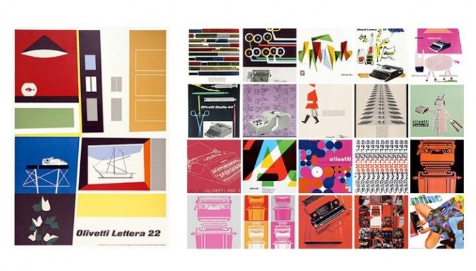
These vintage typewriter ads for Olivetti (shown above)  just blow me away. They are such lovely, illustrated compositions, so different from the full page photo + headline ads of today. Italians certainly know how to design beautiful things, in this case not only the machine but also the ads for it. Illustration is becoming a lost art.
Something I like especially about the Olivetti ads is the focus on the typewriter itself and its functions as art. Showcasing industrial design in this way was unusual. An added bonus is this approach kept the ads from becoming dated in the way so many of its competitors’ ads were, with their appeals to the vanity and simple-mindedness of women.

Of course, this kind of gender bias was par for the cultural course at that time. In the first episode of Mad Men, Joan shows Peggy her desk and remarks that the typewriter looks complicated but that’s it’s so easy a woman can use it. The funny thing is, they have the wrong motivation but the right result — an office machine should, in fact, be designed so that anyone can easily use it.

Barcelona

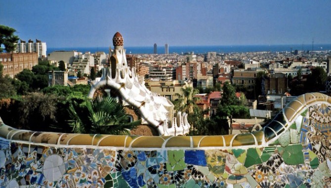
After 5 long years, I’m finally getting around to organizing my Europe photos. I’m starting with Barcelona, a city that stole my heart.
Gaudi has a lot to do with why I loved Barcelona so much — his work is whimsical, colorful, and imaginative in a way that makes me wonder if hallucinogens were in vogue at the time. Every inch of this town is covered with textures and patterns and it was incredible to be enveloped so completely by detail. Even when it was too much (as Gaudi often is) it made me giddy to be in a city that lives and breathes design this much.

What I loved most was how the mundane — chimneys, attic ceilings, benches, vents — was transformed into the exotic. Form follows function, of course, but I see no reason why everything practical can’t also be whimsical or elegant.

Gardening Ethic

There’s an article in today’s San Francisco Chronicle discussing Stanford professor Robert Pogue Harrison’s new book, Gardens: An Essay on the Human Condition. From the article:
“This gardening ethic is very much in danger these days, where the emphasis on cultivation has given way to an emphasis on consumption,” says Harrison, asserting that a Stanford student would be more inclined to inspect another’s backyard on HGTV than to investigate one of the many campus gardens.

“We live in a kind of frenzy of consumerism which forgets that the true source of human happiness is not in the consuming but in the cultivation, in seeing something grow, or caring for something that is not yourself. And I don’t know how much we teach the young this ethic of caring for something that is not yourself. Or even caring for things such as an object or a plant. Consumption and cultivation are at war with each other.”

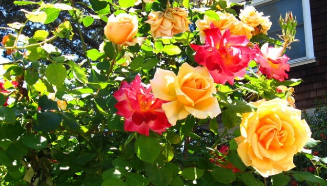
The idea of a “gardening ethic” is interesting. It’s true that lately I’ve been noticing gardens and plants more, and in turn this is making me feel more connected to my neighborhood and the natural world around me. There’s something to be said for literally taking time to stop and smell the roses.

Glass Raindrops

The de Young and the Asian Art Museum are arguably the best art museums in San Francisco, although the bar is not as high here as I would like.

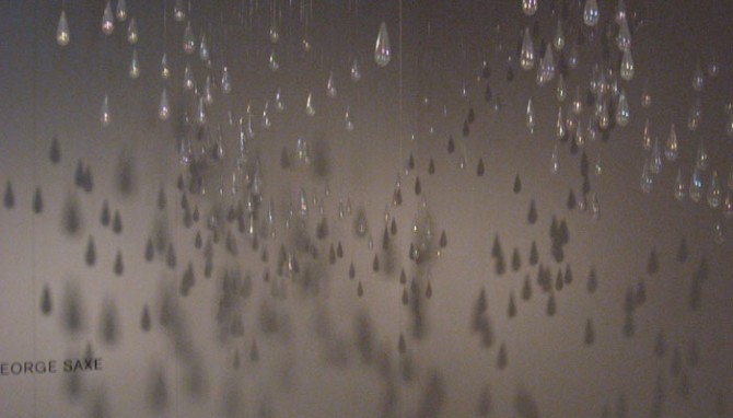
The installation shown above is by Kiki Smith, and it was commissioned specifically for this space at the de Young. I didn’t see it overhead when I was below in the room (maybe I was distracted by the upside-down dog planter bed by Chihuly). Rather, I found it by accident when I was in another gallery and became curious about an overlook at the end of the hall. There is a second hanging sculpture that is a part of this one, but the glass teardrops felt very separate to me and I only saw them as a whole in the shadows on the wall. At the time I thought it is not a good sign about a collection when the best thing in it is shadows. However, after some research I learned the artist fully intended the shadow play, so perhaps it’s simply the best piece in the room. It takes a little bit of work to find the second-floor viewing balcony, but it’s worth it to see this piece.

I Heart Tastespotting

Tastespotting compiles the best in food blogging from all over the world, making it the ultimate in food porn and a very amusing way to waste a bunch of time. Whether you’re looking for ideas about what to cook or just want to admire others’ creativity and talent, this is the place.

In the “OMG That’s Brilliant” category today, we have a pretzel diamond ring, by Roni Baram of the industrial design department at H.I.T, Israel on the left. Top right we have sugar people, waiting to be knocked into to their watery (or coffee-y, rather) graves from Natasha at Nova Clutch.

And the “Food Worth Drooling Over” category is being represented by the Beef Wellington on the lower right, courtesy of Mike’s Table. My nitpick here is it should be made with brioche, not puff pastry, but who am I kidding? It looks fantastic and I’m jealous. The best story of my childhood is how I requested my parents make me Beef Wellington for my birthday…when I was 4.

Urban Decay

What is it about decay that’s so interesting on film?

Just returned from the Windy City — and windy it was! On this trip I went on the architecture river cruise and I spent most of my time trying to capture the undersides of rusting bridges as we sailed underneath them. The accidental compositions are incredible, and the rust adds an interesting touch. They’re being painted right now, so I’m glad I had an opportunity to capture them this way.

When I was in college I had to drive across farmland in Indiana and Ohio on my way to Grandma’s house for Thanksgiving. As I passed countless decrepit, abandoned barns I thought it would make an amazing B/W series to capture the crossed lines of broken boards and the sunlight as it filters through the holes and gaps.

The End of Summer

I’m going to miss summer vegetables! I don’t even like peppers, but this display was so gorgeous I was tempted to become a convert. One of the best things about living in California is the availability of amazing produce almost all year round. Cooking (and eating) is a joy here. I’d always considered myself a foodie, but I had no idea what I was missing until I experienced direct-from-the-source produce and artisan breads and cheeses.

A couple years back my parents moved to the edge of the Bay Area, where the exurbs meet (and demolish) farm land. Driving to see them is a bit of a drive, but I am always rewarded for my efforts by some of the best produce I’ve ever had. (And my family is from Ohio, so that’s saying something!) I can get great food at my local, non-chain stores and much even comes from the same farms, but a tomato is always best when it’s mere hours from the vine. My mom has the best of everything down to a science — corn and blackberries at one farm stand, squash or nectarines at another. These peppers are from one of our all-around favorites, the Smith farm. Sadly, they close in November so no more for the season.