Explainers

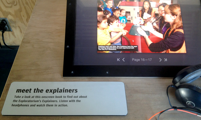
Exploratorium ExplainersThis weekend a friend was in town, and visitors are great prompts to do all the local things we don’t get around to — in this case, the new Exploratorium!

Something that caught my eye is their name for exhibit guides: Explainers. It’s a miniscule detail compared to the immensity and wonder of all the hands-on exhibits, but this struck me as truly the perfect word. In contrast to titles like Docent, Explainer is simple, kid-friendly, and communicates exactly what they do. Bonus points: Exploratorium Explainers is alliterative!

While small, this is a touchpoint that reinforces a playful, thoughtful brand experience.


A sign-off screen that brings customers back

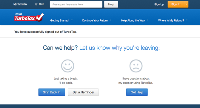
turbotax_messageIt’s supremely frustrating to see customers walk away without knowing why. Because if you don’t know why, you can’t fix it.

After signing out of TurboTax last night, I received the message shown. It’s friendly and smartly user-centric, no doubt the result of research into why people abandon the software. They want to make sure I return, because they don’t get paid until I finish and submit my tax forms through their service.

Displaying empathy and helpfulness, the sign-off screen prompts me to set a reminder to return so I don’t procrastinate too long or find help if I’m quitting out of frustration. Above all, it turns my walking away into an opportunity to improve the customer journey and close the sales loop. It’s a nice example of insights, UX, and messaging coming together simply and effectively. Nice job, Intuit!


Packaging for Dummies

I laughed when I saw this. Part of me wants to be offended by packaging that assumes our incompetence, but considering how many times I’ve overlooked or mangled a resealable strip I have to admit it’s spot-on.

open_here

Mine

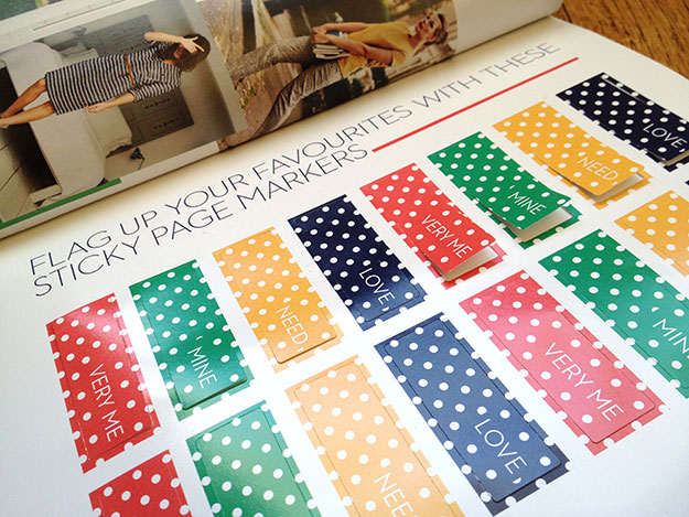
I love this feature in my newest Boden catalog – sticky tabs to flag items you like instead of having to turn down page corners. Arriving days before Valentine’s Day, its messages of “Mine” and “Love” also subtly (cleverly?) call to mind candy conversation hearts.

Putting on my marketer hat, I’d add a tab labeled Gift. Even if the shopper doesn’t end up purchasing any gifts, the prompt nudges them to think about friends while browsing and share Boden items they might like. And, on a personal note, I’d feel less frivolous about shopping if I could convince myself I was also shopping for my friends!

ef_blog_boden

The perfect sentence

Yesterday I experienced one of those rare moments when everything clicks into place and you realize you’ve created something perfect. One simple sentence capturing the essence of brand vision — it has personality and heart without being cutesy, and clarity without being tactical. It is, dare I say it, pithy!

We’ve been exploring brand strategy and key messaging for months, but until now we didn’t have the expression quite right. Considering I’m wrapping up the project this week, my perfect sentence is a timely capstone on a wonderful project!