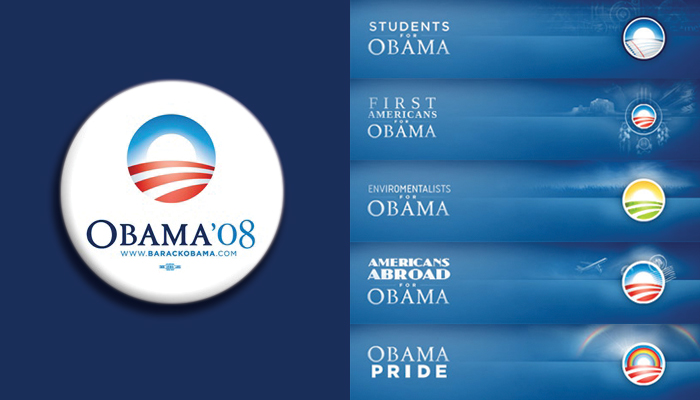
 I’m in awe of Barack Obama’s campaign identity. I have never seen a political identity this sophisticated — it’s simple, well-rendered, and somehow it manages to turn an American political cliché of a sun rising over farmland into good design! That’s remarkable on its own, but the flexibility this one little mark has provided is astonishing. There are versions for every state and every group and they have plastered it on every available surface on the official site, and somehow it all works together cohesively and attractively. I think it’s a great idea to let the mark itself morph substantially for the iterations; the payoff of individuality overcomes any risk of lack of consistency.
All about the O
 I’m in awe of Barack Obama’s campaign identity. I have never seen a political identity this sophisticated — it’s simple, well-rendered, and somehow it manages to turn an American political cliché of a sun rising over farmland into good design! That’s remarkable on its own, but the flexibility this one little mark has provided is astonishing. There are versions for every state and every group and they have plastered it on every available surface on the official site, and somehow it all works together cohesively and attractively. I think it’s a great idea to let the mark itself morph substantially for the iterations; the payoff of individuality overcomes any risk of lack of consistency.