Olivetti

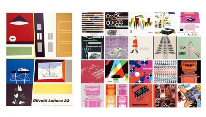
These vintage typewriter ads for Olivetti (shown above)  just blow me away. They are such lovely, illustrated compositions, so different from the full page photo + headline ads of today. Italians certainly know how to design beautiful things, in this case not only the machine but also the ads for it. Illustration is becoming a lost art.

Something I like especially about the Olivetti ads is the focus on the typewriter itself and its functions as art. Showcasing industrial design in this way was unusual. An added bonus is this approach kept the ads from becoming dated in the way so many of its competitors’ ads were, with their appeals to the vanity and simple-mindedness of women.

Of course, this kind of gender bias was par for the cultural course at that time. In the first episode of Mad Men, Joan shows Peggy her desk and remarks that the typewriter looks complicated but that’s it’s so easy a woman can use it. The funny thing is, they have the wrong motivation but the right result — an office machine should, in fact, be designed so that anyone can easily use it.

Don’t Litter!

Why is it that people have to be told not to litter?

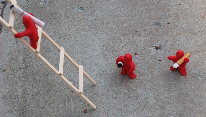
A CCA grad student created a small set of installation pieces, evidently as a statement against cigarette-butt litterbugs. In this scene, a series of little clay men carry inappropriately discarded butts from the base of a tree, across the concrete, up a ladder, finally depositing them in an ash tray on a bench. In another scene, the red figures have erected a fence around a storm drain, drawing attention to the “No Dumping” signs.

Barcelona

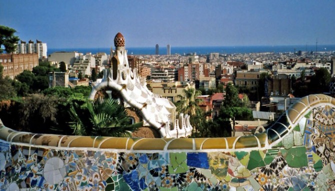
After 5 long years, I’m finally getting around to organizing my Europe photos. I’m starting with Barcelona, a city that stole my heart.

Gaudi has a lot to do with why I loved Barcelona so much — his work is whimsical, colorful, and imaginative in a way that makes me wonder if hallucinogens were in vogue at the time. Every inch of this town is covered with textures and patterns and it was incredible to be enveloped so completely by detail. Even when it was too much (as Gaudi often is) it made me giddy to be in a city that lives and breathes design this much.

What I loved most was how the mundane — chimneys, attic ceilings, benches, vents — was transformed into the exotic. Form follows function, of course, but I see no reason why everything practical can’t also be whimsical or elegant.

Defining Art

Last weekend there was a highly critical article about the Chihuly exhibit at the De Young that really got my back up. The money quote:

“The history of art is a history of ideas, not just of valuable property. Chihuly has no place in it, and the de Young disserves its public by pretending that he does.”

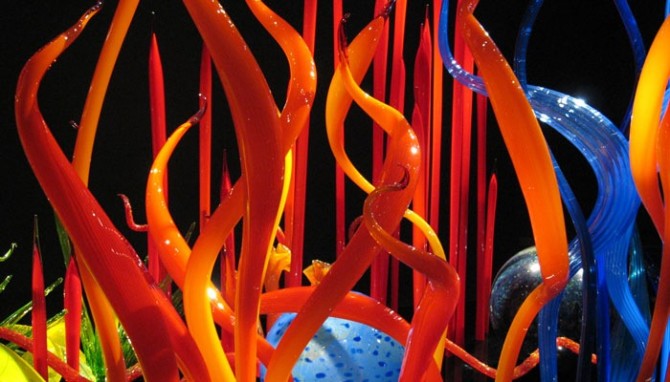
I have my own criticisms of Chihuly — primarily that his work can be overly gilded and that commercial success has led to excessive repetition — but there are ways to critique an artist without declaring his work isn’t art. The author’s main arguments seemed to be that the exhibit is a spectacle and not serious enough, and that Chihuly’s work is too flamboyant and decorative to be considered “art”.

The former is more than a little puzzling. Yes, the exhibit is a spectacle and the gift shop is indeed “barnacled” on. But this criticism could easily be made of much modern culture and art, and it is unfair to single Chihuly out. His work is flamboyant and showy, but that just makes a theatrical exhibit seem all the more authentic. On the other hand, despite the spectacle the author claims “educated viewers” will get bored because is not enough intellectual content to hold their interest. That must mean I’m not educated, because there were plenty of beautiful visuals to keep my attention.

It’s also seriously misguided to claim that art must be high-concept. We do have rough categories of fine art, decorative art, craft, and the like, but the lines are blurry at best. Going by the author’s yardstick, we’d have to disregard half of the “history of art”! Dutch and Flemish masters are a good example — the technique is remarkable, but in the end it’s often just a painting of of a dead rabbit, a rich patron, or a vase of flowers. Where’s the intellectual statement there? And yet we don’t question those paintings as art.

Perhaps more importantly than how he defines art is the arrogance of claiming to define art for others. As the resident creative in my family I spend a lot of time defending art, and I think it’s important to take a broad view of it. If it expresses something, even if I don’t like or understand it, it can still be considered art. You don’t have to like it or agree with it, but it’s generally not appropriate to define someone else’s experience. That’s not to say you can’t ever draw a line, but you should draw it as generously as possible.

The entire article felt like a thinly veiled assertion that if the masses like it, it can’t be art-with-a-capital-A. Enough people already question and dismiss art without elitism like this to alienate them further. It occurs to me artists complain art isn’t appreciated, but often they seem to work very hard at preserving image of the starving, misunderstood artist. After all, if the plebeians get it, it can’t be any good.
Great Moments in Advertising

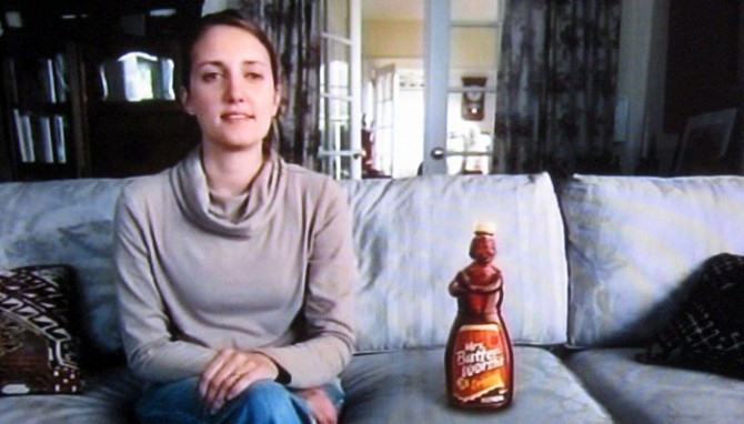
The best part of having a DVR is skipping commercials, but once in a great while something is intriguing enough to make me to stop and rewind. Most reliably I stop for VW, Apple, and the celebrity Geico ads. My favorite Geico spokesperson was Peter Frampton — a little sad for him, but funny for us — until I saw the Mrs. Butterworth spot, which stole my heart. She turns every comment into something about pancakes, syrup, or glass bottles, and the very best moment comes at the end: when the Geico logo comes up on the screen she says “Oh dear, someone has put a logo over my face.” Blatant product cross-promotion aside, it’s hysterically funny.

I don’t know how effective these ads are in terms of generating sales. On the plus side, I’d guess they’ve created major, durable name recognition. I never forget who the advertiser is, which is certainly something funny ads struggle with. (We all remember herding cats, but do you know what the company was?) On the negative side, they have several entirely different advertising campaigns running simultaneously, which makes them look schizophrenic. Also, while the style of the ads skews young, I am not sure if anyone under 30 even gets the jokes. Do they know who Charo, Frampton, or Little Richard even are?

That said, I stop my Tivo to watch their ads and now I’m blogging about one of them. I’d say that qualifies as effective.

Genius

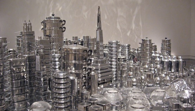
Zhan Wang’s stainless steel sculpture of San Francisco was an impressive installation, even though it was hard to visually sort a sea of shiny stainless steel and in a few places it felt like the artist ran out of steam and just started throwing in extra tea kettles.
What I like most about it is how accessible it is. Even if a viewer is not interested in the sociopolitical theme, they can still appreciate it visually and admire the ingenuity behind it. Everyone I saw enter the room spent at least 10 minutes looking at it, and some even talked to each other about it. Art that inspires people to become engaged and discuss it with strangers is the best kind.

I also love that once it’s dismantled, the pieces can be reused for another sculpture or be used as originally intended.

Glass Raindrops

The de Young and the Asian Art Museum are arguably the best art museums in San Francisco, although the bar is not as high here as I would like.

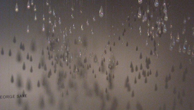
The installation shown above is by Kiki Smith, and it was commissioned specifically for this space at the de Young. I didn’t see it overhead when I was below in the room (maybe I was distracted by the upside-down dog planter bed by Chihuly). Rather, I found it by accident when I was in another gallery and became curious about an overlook at the end of the hall. There is a second hanging sculpture that is a part of this one, but the glass teardrops felt very separate to me and I only saw them as a whole in the shadows on the wall. At the time I thought it is not a good sign about a collection when the best thing in it is shadows. However, after some research I learned the artist fully intended the shadow play, so perhaps it’s simply the best piece in the room. It takes a little bit of work to find the second-floor viewing balcony, but it’s worth it to see this piece.

Genius

I can’t wait to see this sculpture in person! The city of San Francisco, replicated in stainless cookware. What’s not to love? I especially love the interpretation of docks and piers. From the Asian Art Museum site:

“For his exhibition at the Asian Art Museum, Wang has selected rocks from the foothills of the Sierra Nevada, alluding to the nineteenth-century Chinese immigrant experience of mining gold during the California gold rush. Both the actual rocks and their stainless steel versions will be exhibited. The artist will also create a topographic San Francisco cityscape–one of his ‘urban landscape’ series– using steel rocks, mirrored surfaces, silverware, and stainless steel pots and pans.”

I Heart Tastespotting

Tastespotting compiles the best in food blogging from all over the world, making it the ultimate in food porn and a very amusing way to waste a bunch of time. Whether you’re looking for ideas about what to cook or just want to admire others’ creativity and talent, this is the place.

In the “OMG That’s Brilliant” category today, we have a pretzel diamond ring, by Roni Baram of the industrial design department at H.I.T, Israel on the left. Top right we have sugar people, waiting to be knocked into to their watery (or coffee-y, rather) graves from Natasha at Nova Clutch.

And the “Food Worth Drooling Over” category is being represented by the Beef Wellington on the lower right, courtesy of Mike’s Table. My nitpick here is it should be made with brioche, not puff pastry, but who am I kidding? It looks fantastic and I’m jealous. The best story of my childhood is how I requested my parents make me Beef Wellington for my birthday…when I was 4.

Cathedral of Christ the Light

The Cathedral of Christ the Light is being constructed in Oakland overlooking Lake Merritt. I can’t wait to see the final result, especially to find out how much of the exposed structure will remain visible from the exterior.

Considering the amount of concrete and steel in use, this structure is remarkably graceful. I find most old churches depressing and most modern ones charmless. This one, however, is incredibly beautiful and uplifting.

For the architecture lovers out there, the cathedral was designed by the venerable Skidmore, Owings, and Merrill.